You can say I have a brainstorm today (but the truth is I only have a storm where I live and I don’t have brain).
Look at this again:

Problem with this screen is that it has too much chaotically placed info. So I made a little makeover depicting how it could look to be less cluttered:
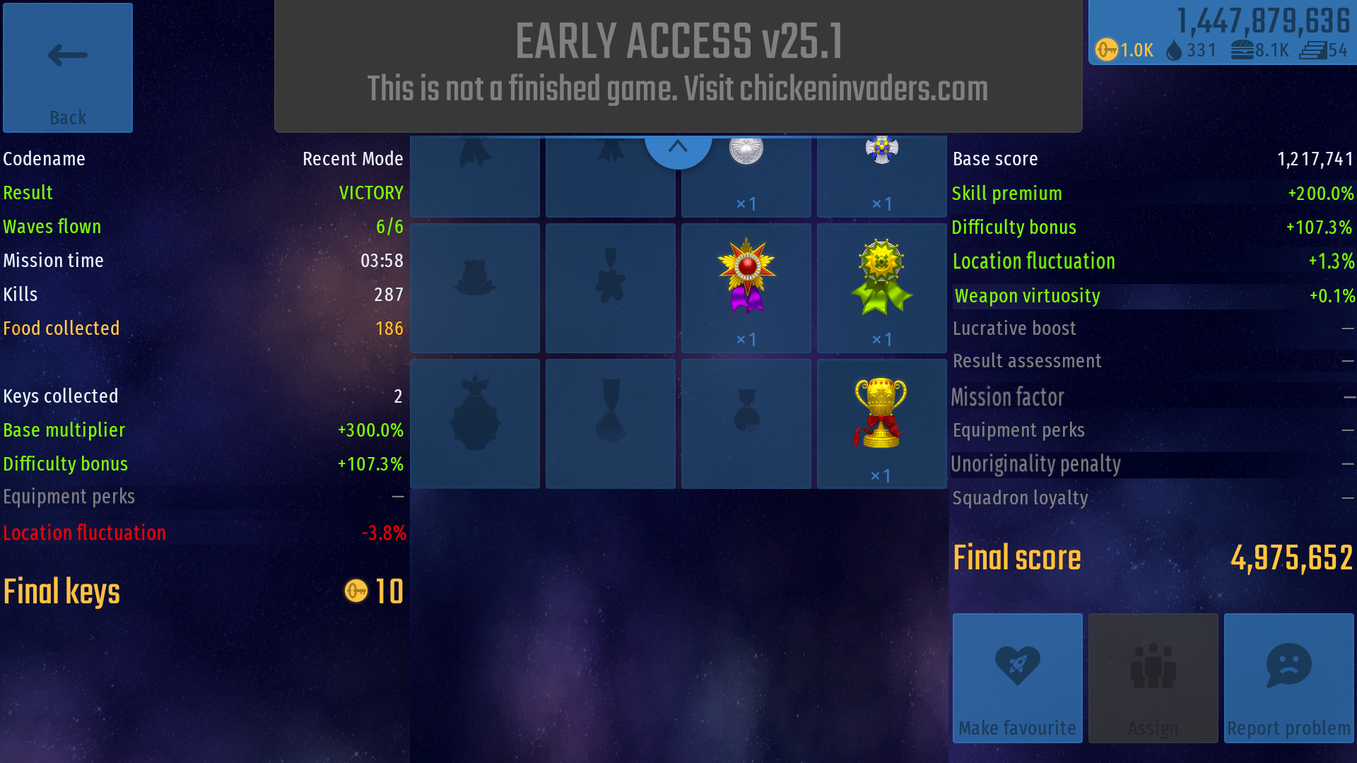
List of changes:
- No medal silhouettes that you can’t get in the mission - what is the reason there are available spaces for medals that you can’t get? Above I cut every other trophy for finishing the level because you can only get 1 trophy when winning and the rest is not needed there.
- Multipliers sorted by value - This way not only you have them organized by colors, but even with how much they are worth. So it looks kind of better.
- Emphasizing the score and food - I think that we should make the “final score” and “food” values look more special because they are worth something in the game. They aren’t just for the statistics. Food can be sold to get keys so it’s much important than for example “mission time” or “kills”. “Final score” is important because you can get tier levels with it. And there are some things that you can only access when you have certain tier level so “final score” is also more important.
Something that I didn’t include in the picture, but I think is worth thinking about:
- Do we really need so many multipliers? Right, some things are better to be shown as a multiplier, but some can be skipped and just included to the score at the very start of the game. I’m talking about “skill premium”, “difficulty bonus”. They don’t change based on how you play the mission. They only change when you start it so they can just be included in the base score and this way we have less cluttered statistics.
 Hint” button under the Final keys section, to the bottom left of the screen that explains all the bonuses.