Pardon me replying to only the last post. I’ve read all others, but don’t want to reply to them all so just gonna join the last.
I get the use of literally for strengthening the argument (god knows I also do it) even though it’s not always 100%, but in your case this is really not true so you shouldn’t use that.
Here 2 games that I have installed:
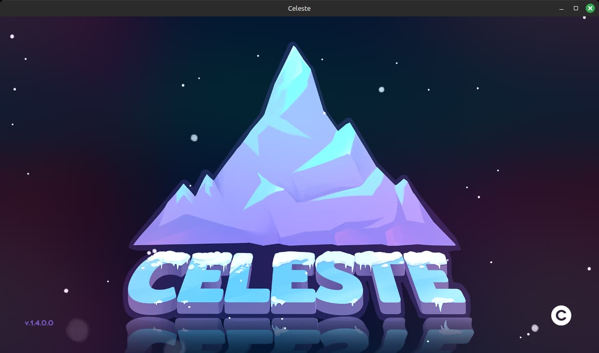
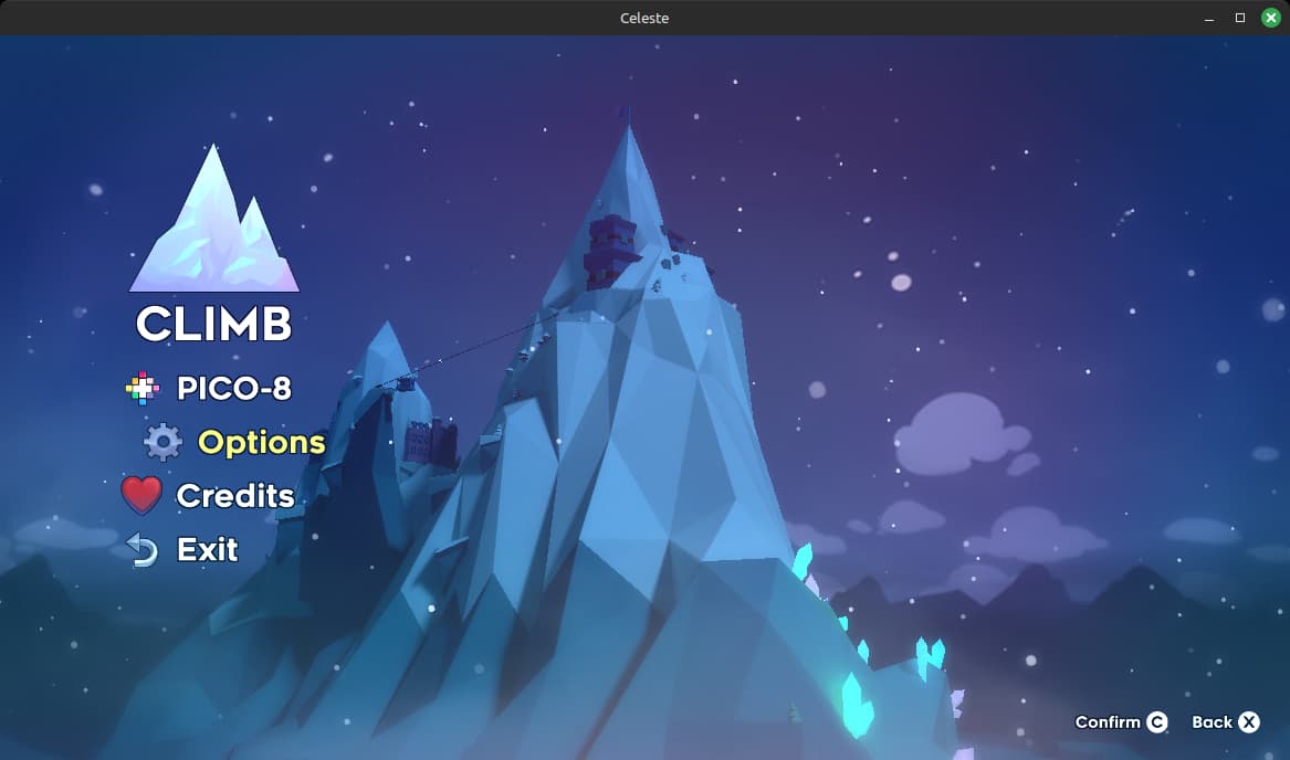
Celeste (at first boot it has a splashscreen, but the logo could just be placed in menu so no big deal):
You can ignore the PICO-8 because it’s an unlockable play mode which you can skip so it doesn’t show in the menu.
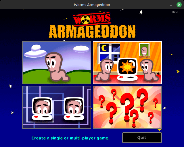
And Worms Armageddon (the question marks are the options menu):
IA just said he considers possibly removing it. It’s extremely vague even for IA. Could just be something he thought about for few minutes.
Honest question. Did anybody had troubles finding the play button in CIU? I feel like if a big button with “Play” text written on it is too hard to find then it’s a literacy problem not a design one.
But why do it at all? On FHD screen all the things are placed in such a way that scrolling is not needed. Or at least would be if IA presumably didn’t insist on showing all the trophies: Mission complete screen
40 Summer Color Palettes to Vitalize Your Creative Output
#JusticeForPlanetaryMissions
Excluding those things above. I do agree with removing the version info from main menu. It can just show in the options screen and it would look better. The account button should also stay in the options menu.