It looks weird.
“It’s What It Is!”
sideways icon confirmed?
Jokes aside though, this is an easy medal lol
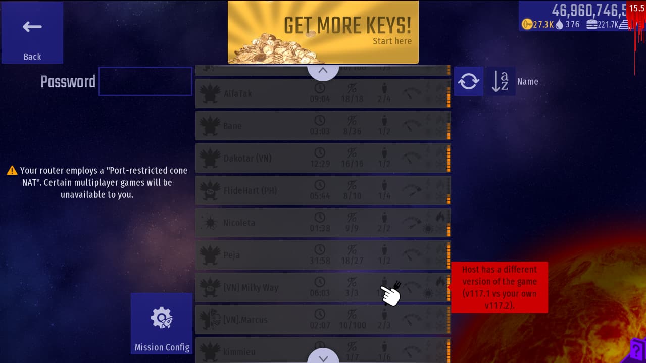
They probabky havent downloaded the emergency patch and like how other games work, for multiplayer, players should have the same version to play.
1 Like
Yes
No particular reason. Just to make them more different than regular chickens.
I’d prefer to keep it.
Looks better to me ![]()
I can’t change it any more without a special exception.
Pointless still drop atom/gifts/keys (because these are limited anyway). They just don’t drop food or coins.
We just changed that. ![]()
It’s a bug. Fixed in v.118 ![]() Bug
Bug
8 Likes
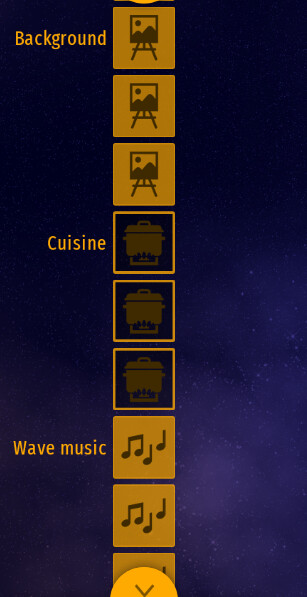
Idea: In the bottom middle there should be a background icon, if you mount a background in it it will be the background for the entirre galaxy (or universe)
Also:Foggy and Rainy Enviornments. Part 1
Foggy and Rainy Enviornments. Part 2
2 Likes
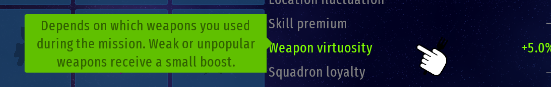
Idea: I think it should give examples of weak or unpopular weapons because Its’s not exactly clear.
Well weak/unpopular weapons are like slow or misses the most from enemies (for example: Utensil Poker, Absolver Beam, Neutron Gun, Moron Railgun)
1 Like
2 Likes
Not sure if it’d work on lower resolutions.
I mean it decreases the time of a player putting their config and stuff
1 Like
Danger Zone isn’t filled entirely.
1 Like
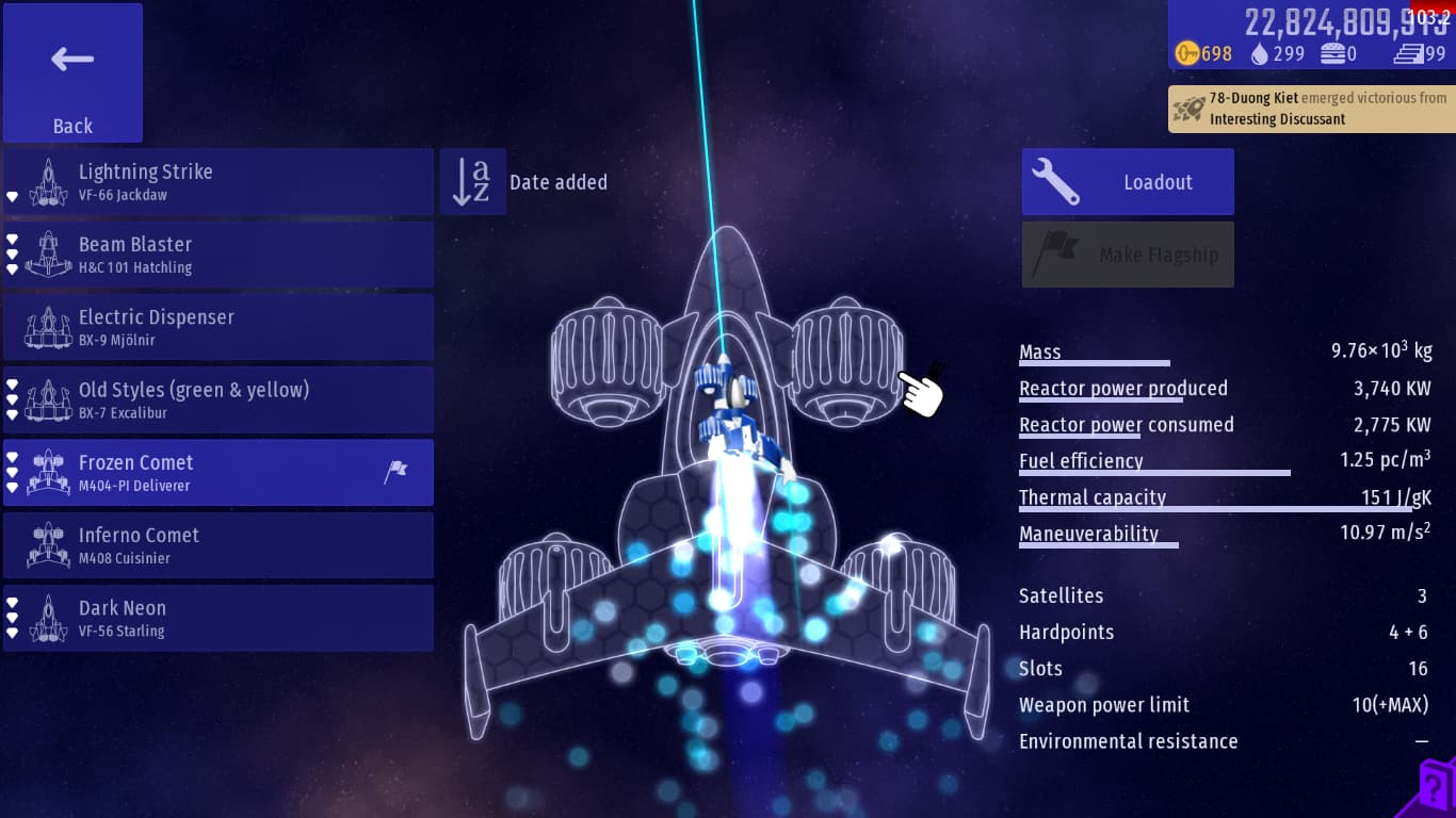
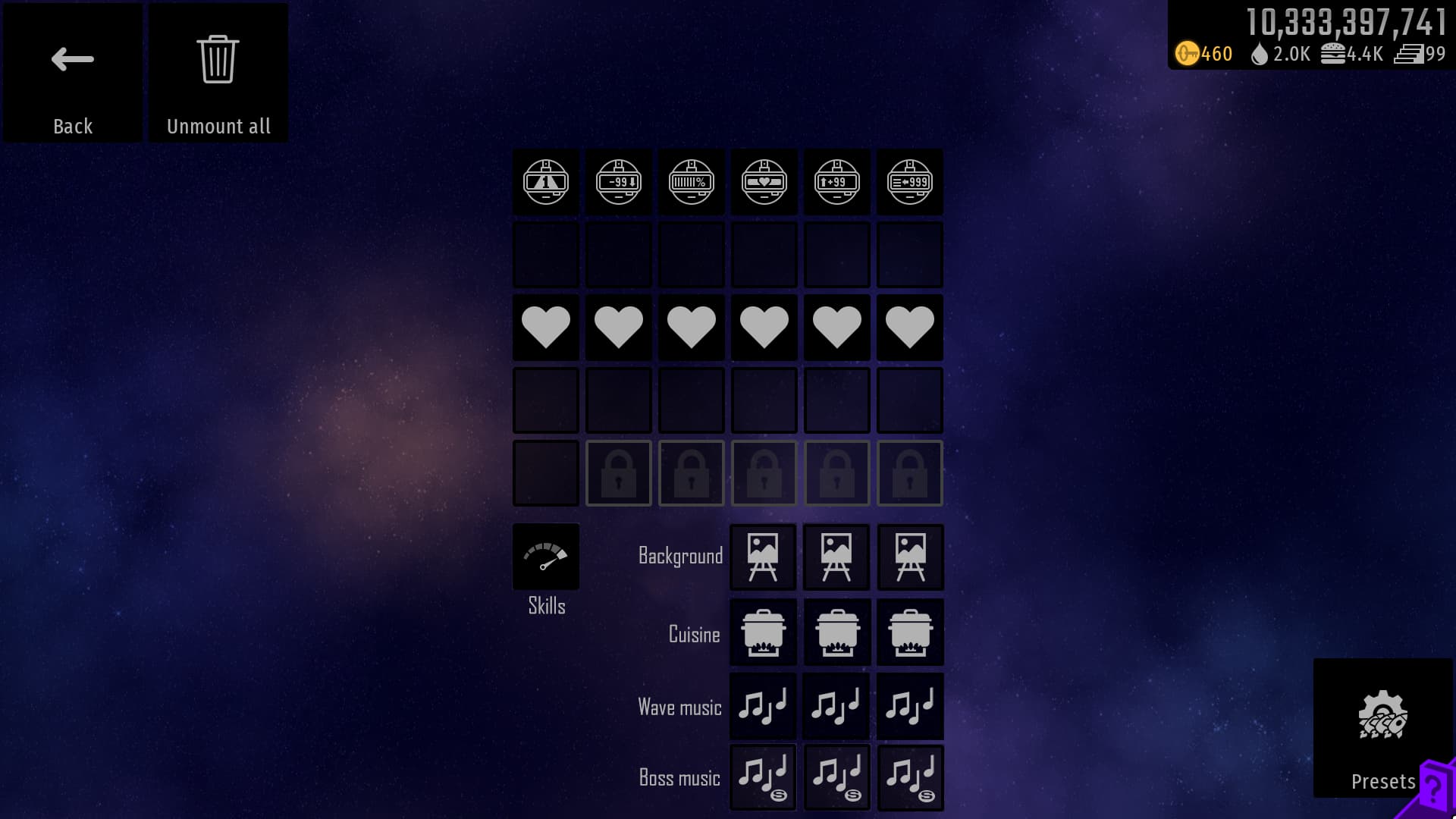
I have a suggestion: if the selected spaceship can now be shown briefly with animation, then I think we should delete the model in the back (the one my mouse is pointing at), it should only show up when we equip something in Loadout, and when we enter the fleet, the ship will be displayed without the old model like the previous versions
6 Likes
already suggested: Early Access version 117.2 - #5 by MoonKnight
1 Like
And answered:
2 Likes
got it, but iA decided to keep it, then it look quite not comfortable for the showcase
I asked this when the vertical scroll thing got implemented in the first place.
Reason why it isn’t like this was because “no space for names”
Not gonna lie this idea is getting quite a crowd for it, suggested first by @MoonKnight, and me not long after that.
So we’ll put a poll on it for good measure.
Should the grid-ship behind the previewed ship be removed from ship preview?
- Yes
- No
0 voters