I was planning to switch gears and go into technical issues today, but evidently there is still some graphics work to be done. Might as well tie up any loose ends before I move on.
Heart
This is a special case because it’s actually bitmap created by a TrueType font character. The information about which font was used has been lost – all I have is the rasterized data:
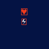
Interestingly, there also seems to be a lightning icon 🗲, which clearly ended up being unused. A precursor to CI3? An icon truly ahead of its time.
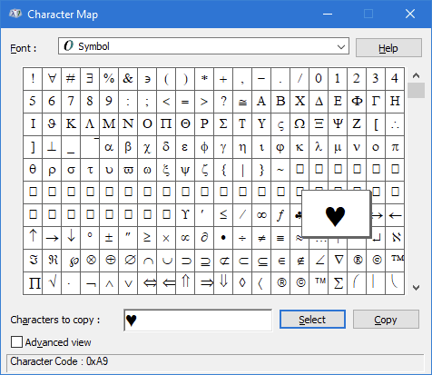
Anyway, there are many options for replacing the heart icon, but I want something that resembles the original shape as closely as possible:

Eventually I settle on using the old “Symbol” font (which is probably what it originally was anyway):
P.S. This whole process took way longer than expected. It’s always the little things that end up taking the longest.
Exhaust
I eventually come to grips with the fact that my hand-painting skills are terrible, so I substitute skill with technology instead. In what is perhaps the largest overkill (and the most ill-advised decision) of this project, I’m going to 3D model the exhaust from scratch. Complete with 2-frame animation!
I go through several iterations, but generally I’m not happy with the results. Part of the problem is that exhausts naturally have a lot of translucency, but want to steer clear of that and I would rather have something more solid-looking instead. Recall that the original game could not do translucency at all (only simple color-keyed transparency – black pixels were simply not drawn), so anything that is translucency-heavy will clash with the rest.
In the end I settle on this. It fits the rest of the art style and it looks much better in motion (you’ll have to take my word for it):
Logo
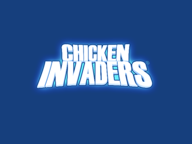
I’ve already “remastered” the official game logo. “Remastered” is not quite correct as a term, because I simply retrofitted what would later become the official logo of the series (starting with CI3). That can’t really change – but I’m now looking at the in-game logo just before you start the game(*):
* Incidentally, this screenshot makes the lack of translucency in the game painfully apparent. Just look at the glow around the letter S of the logo, and how it completely overwrites the starfield behind it.
I haven’t yet gone through it in detail here, but I want to make a clear distinction between the core of the game (the mission itself – everything starting with the menu screen you see above), and the ancillary parts (introduction, outro, menus to set up graphics/sound/controls, etc). During the mission, remastering rules are much stricter and the number one priority is to preserve the spirit and the aesthetics of the original game. For the ancillary parts, things are more relaxed and pretty much anything goes (you’ll soon see that the entire introductory sequence will be remade from scratch).
The issue with this logo is that it appears both in the introduction (ancillary) and in the mission (core).
So whatever we do, it’s not going to be ideal. Ooohhh… this is a tough one.
An additional problem is that I don’t seem to have the original logo in a higher resolution (did I ever?). What you see in the screenshot above is the best I have.
Although… the original CI2 (not the remastered version) uses a very similar logo…
.. but it’s only barely larger, so it doesn’t gain us much.
After digging through my files, (much, much later) I find a better option: The logo from the CD label of the original CI2 (yes, that was a thing at some point). It’s 2560x1920 (!), which is plenty for our purposes, and it’s obvious by the art placement that I was using the CI1 logo as a reference. So it strikes a perfect balance for our purposes – it just needs some color adjustment for its glow.

Font
After a cursory inspection, It turns out that the new font has a vertical alignment problem against other art. The issue is that the old font had a bounding box that’s tightly placed around only the existing characters (a-z, 0-9, plus some punctuation), but the TrueType font has a much taller box which includes space for diacritics and other decorations.
(*)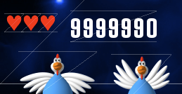
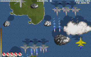
* By the way, does anyone remember whether the heart icons overwrote the score when you had more than 4 lives? I certainly didn’t.
This will need to be manually fixed whenever vertical alignment is required (which is not that many places in CI1).
And with that, I think all graphics are done (for now). Next up, code!