Well… I asked for it, so here comes the second round.
Sorry, let my rephrase then: “I can’t think of any game that has the options button right next to play button like in CIU, not that I know, at least”. Hope this would be better.
Pardon, but these two games are really bad exemples for your counter argument, and I explain why:
Celeste has always been a game for consoles and PC, not for mobile, so the layout is of course really different than the CIU one or really any other exemple of mobile games main screen I showed in the first post, because of course the UI it’s not design for touch screens. CIU is for both PC and mobile, so of course it’s UI does take the thouch screen into account.
This exemple is even worse because it has a completely different design than traditional mobile games main screen. I don’t really know if this screen in particular is from PC, consoles or mobile, because I never played worms in my life, but I can say that the buttons are big for sure, so it could also work on mobile, but still, it’s a very unusual design for a main screen compared to my previous exemples. The buttons rely entierly on pictures, not even icons or text; only after you select them a small text at the bottom tells you what those buttons are for. And to top it off:
This is a really strange and unusual designfor an options buttons. Like “a bunch of questions marks”?.. I would guess at first glance it’s some sort of “random mode” or perhaps a “how to play” or other kinds of tutorial or explenation about the game. I never would have guessed that button was for the options if you didn’t tell me, but even if I played myself and then clicked on it or read the text, I would have still gone like “Ah… this… is the options button… good to know (I guess…)”. If there was like a worm with a wrench or something like that I would’ve immidiately thought “Ok, so I assume this is the options button”.
Regardless of design choices, it varies from game to game, and in CIU case, it’s main screen is mainly designed for PC and mobile, and it’s very similar to other mobile games, so may as well make it “standardized”. This is not because I want CIU to lose it’s identity and become more similar to other mobile games or anything like that, I just think it would make the main screen cleaner and more intuitive, that’s it.
If he did thought that there must have been a reason for it. Perhaps even him found it a bit unnecessary at some point, but this is just pure speculation.
I meant that I just I found it unnecessary to have the options button as big as the play button, in the context of the CIU main screen and general mobile mobile games main screen design.
Yes. Kinda of thinking of it, it’s all for those goddamn throphies slots that makes the the slots uneven and make you scroll down a bit just to see the full thing. And speaking of which:
Dude, that is SO GOOD! It basically fixes everything wrong with the current resoult screen (except the buttons hight at the bottom right corener, but eh). I especially love the “don’t show medals or trophies you can’t get in the mission you just played”. Perhaps only the thropy part could be changed, like indeed; just show the thropy you get for that mission depending on the difficulty, so from 6 slots they become only 1 and suddenly they’re even and you don’t even need to scroll down; problem solved. As for the medals, I think most of them can still be obtained in every kind of mission in one way or another. Perhaps it will not have sense to view the appetite medals for the comet chase missions, since you can’t food in them in any way, but it is very specific depending on the mission type and there’re very few cases like this, and besides, it will ruin the frames layout, so I think this rule should apply for the trophies only (in my opinion). And I also totally agree on highlightning the food and final scrore stats. I get that the keys are golden so it fits more for them and not much for the other stats, but I kinda like that as well. So yeah, IA, take note (please…).
I mean I get that the current color for the summer edition refers to the tropical beaches water, but I feel like a warm color would fit better for the summer edition. Then again, christmas edition has red, and I find it fitting, and it’s a warm color, but there is a little difference, wich is that that christmas edition is not winter edition, in wich case celeste like color would have fitted better, but it is the christmas edition, and christmas has an entierly different color scheme than just regular winter, so the red in that case does fit well. Summer on the other hand is not really an holliday, but just a season, and the season itself it’s hot so I repeat what I said; I think that a warm color fits it better, that’s it.
Don’t worry, I’m sure they will come at some point; IA said he would like to make them some time in the future. We don’t know when or even if they will come up, but the chances are there so there’s hope for them.
Ngl, it’s kinda refreshing to see someone that agrees with me on those two things that VerMishelb is completely against (again, it’s just personal preferences).
Kinda perfectly continuing with the previous reply, this is just your own personal opinion. As you can see, I’m not the only one who finds it cleaner without the info text in it.
I mean sure; the leafs of plants in the campaigns being hitted by the sun is kinda understeandable, but you know; when people think about summer they think about sun, beach and sea. The leaf green color is more fitting for spring, because it’s the season where nature awakens, so trees, plants, flowers, grass and so on. Kinda of thinking about it, even though easter edition uses this color, the edition is about the holiday, not the season itself. For easter I would think of a more fancy color, like pink or cyan, but eh, the current color for it doesn’t bother me that much unlike summer edition tbh, so whatever.
lol.
Oh ok.
Ah so that was intentional (I guess…). And yes you did a lot of complaints about most of my suggestions, but that’s totally fine; I specifically asked to do that freely, and besides, most of them were vaild enough (and other ones… not so much, but still).
That’s a really fair point; measuring individual pixels is not hard, and once you know the exact values it would be easy to modify them at will, but still, any kind of cheat will resoult in instant ban, so I don’t think how that would change anything tbh. And besides, he already kind of approved it, even if in his own way, so I don’t really think is that unlikely to be implemented somehow:
I repeat my previous rephrase: “I can’t think of any game that has the options button right next to play button like in CIU, not that I know, at least”. Hope this would be better.
Again, this is just personal preference; some people will agree, some will not.
Ah yeah, you’re right. I completely forgot about that because I installed StartAll Back, which basically fix everything wrong with Windows 11 taskbar, start menu and file explores, including the option to not only resotirng the old options menu from Windows 10, but to even make it look on theme with Windows 11. And it even has support for Windows 7 themes for those if you prefer them. Sadly no Windows XP though. Here are some exemples of how it looks btw:
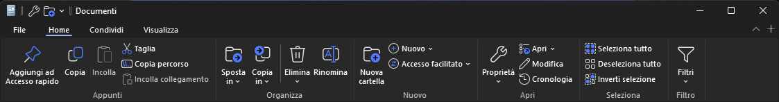
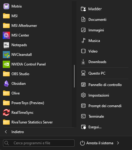
I can definetely reccomend it, it makes Windows 11 actually look good.
But yeah, as pointed out by you, the default Windows 11 is complete shit; too convoluted in the start menu and way too minimal in the options menu and left mouse button menu (I have a program that fixes that as well, can’t remember what it was though; perhaps powertoys, but I’m not sure).
Either way, thank you guys so much again for you feedback and replies. Again, if anyone has more to add then go ahead; I’m getting used to it by now.