Suggestions and Ideas Collection

I took a period of brake from CIU due to burnout, lack of interest and other real life problems, but now I have more time, less problems and interested again in CIU again. So during the last three months I’ve been building up a a collection of suggestions and ideas that could possibly improve the game in one way or another, so I wanted to share them with you.


Screens Redesigns


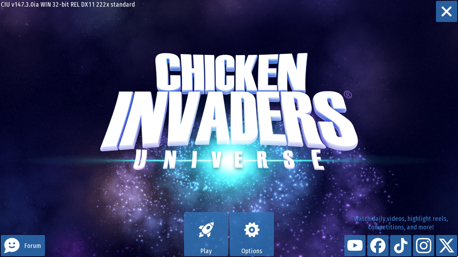
Main Screen Redesign 2.0

I already proposed a redesign of the main screen some months ago, however, I came up with a new design that I think could be much better than the previous one:

Ok ok. I know at first glace you would think “WTF is this sh…”, but let me explain. I’ve took a look at other mobile games’ main screen, and noticed there are quite a lot of elements in common, and that’s precisely what inspired me to make this other redisgn of the CIU main screen.

Before showing some exemples I just quickly want to do a brief summury of the layout:

  • Play button at the center (under the title)
  • Options button at the bottom left corner
  • Info button at the upper left corner
  • Exit button at the upper right corner
  • Socials button at the bottom right corner

So let’s see some exemples of other mobile games’ main screen before explaining this layout in deteils:

Mobile Games Main Screens
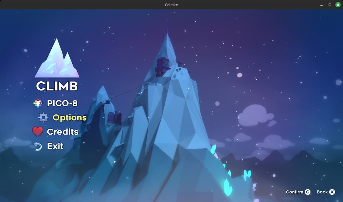
Zombie Catchers

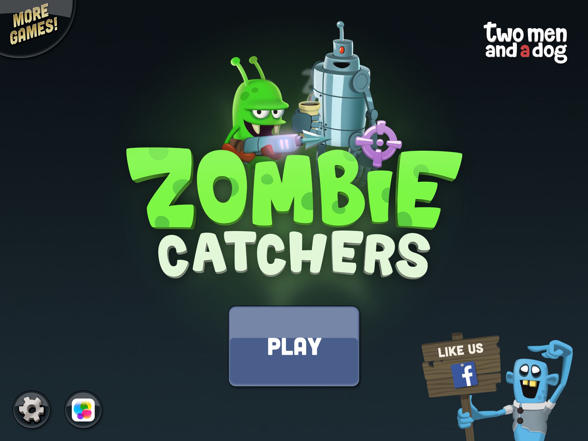
First one on this list of exemples is the Zombie Catchers main screen. Notice some similarities?

  • Play button at the center (under the title)
  • Options button at the bottom left corner
  • More games button at the upper left corner
  • Socials button at the bottom right corner

Tigerball

Next we have the Tigerball main screen. This one’s a bit different but still retains some elements, like:

  • Play button at the center
  • Options button at the upper left corner

Angry Birds

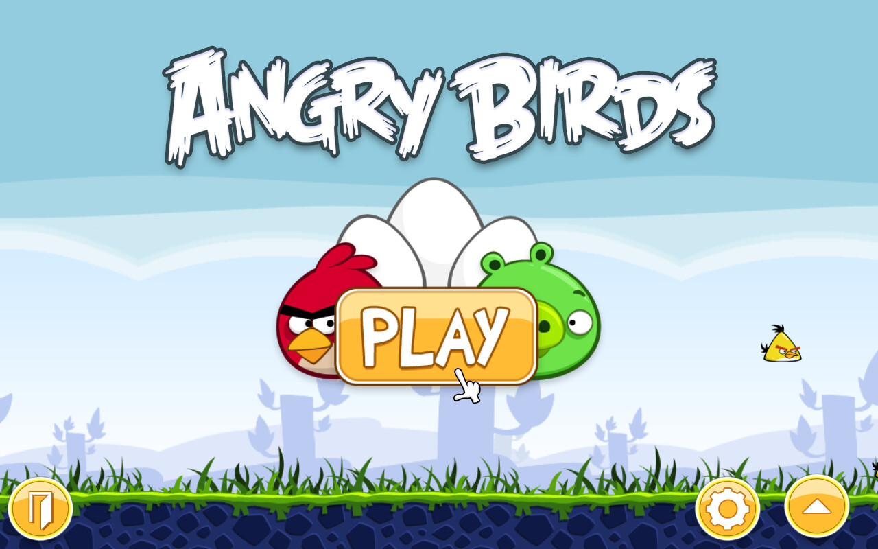
The Angry Birds main screen has seen several redesigns over the years, but the core elements are still layed out in the same way, mainly at the corners or usually in the bottom part. In this case we have:

  • Play button at the center (under the title)
  • Options button at the bottom right corner (near the other options button)
  • Other options button at the bottom right corner (it shows more stuff like info and socials)
  • Exit button at the bottom left corner

Here’s another exemple with the sub menus opened:

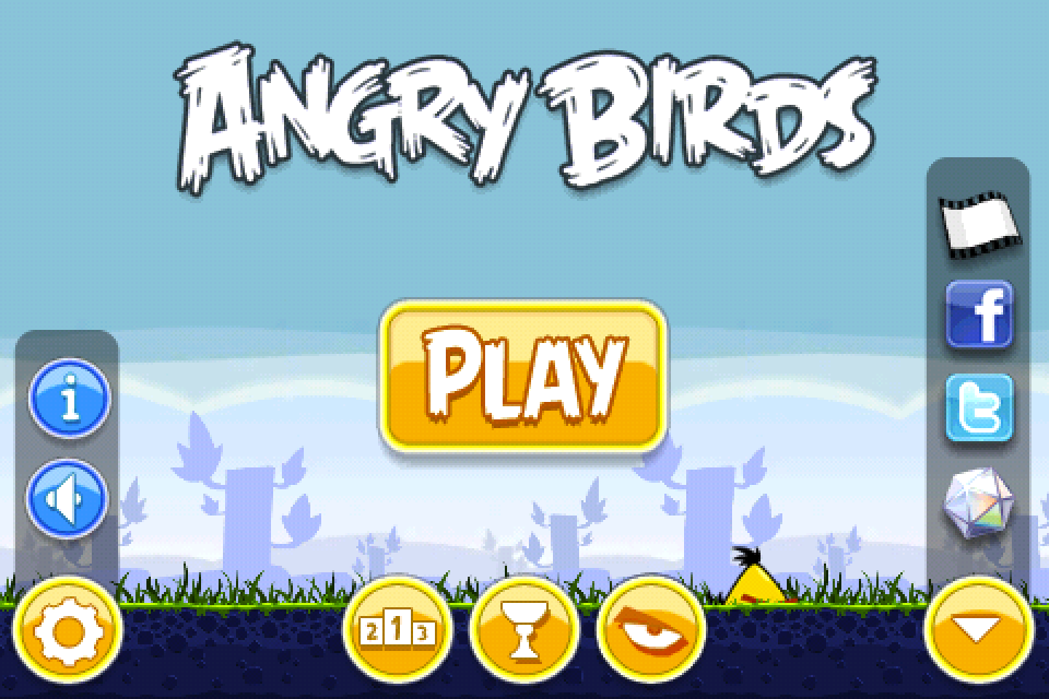
This one shows that the legal stuff and other game information are kept behind an info button inside the option button. The other button on the bottom right corner includes the socials, and it’s a cleaner way to include them without showing them directly in your face like in CIU. That said though, I know a lot of modern games have the socials buttons directly in the main menu, but as you can guess I think they make the screen too cluttered, and CIU is no exemption, but that’s just my opinion.

Geometry Dash

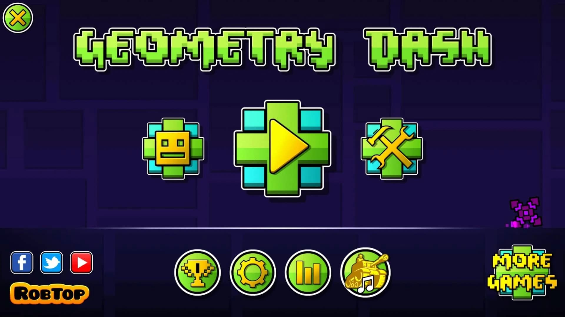
Last but not least we have the Geomtry Dash main screen, which is probably the most interesting case. Let’s start with the elements in common to my CIU main screen redesign:

  • Play button at the center (under the title)
  • Options button at the bottom left center
  • More games button at the bottom right corner
  • Exit button at the upper left corner
  • Socials buttons at the bottom left corner

I think you got the point now: all these mobile games’ main screens have a lot of similar elements, mainly the play button, which is always at the perfect center, an options button, which is just the gear icon and layed out somewhere around the frame of the main screen, an exit button always in a corner, a place for the socials buttons, either showed up directly or hidden behind a dedicated button, and some times a more games button.

Summary

The point of this second CIU main screen redesing and the exemples of other mobile games’ main screens are NOT that I want this redesign to be implemented exactly as it is, but rather, this was a big overview of general mobile games main screen layout. I do belive that there is still room for improvement for the CIU main screen, and this redesign and exemples were just to give an idea of a better way to layout every element.

Now let’s go back to the current CIU main screen and see what I mean:

Compared to the other games I listed, there are quite a few elements that don’t really fit in my opinion:

  • First: what’s the point of keeping the option button as big as the play button if those two are the only two big buttons remained after the other buttons on the bottom center have been moved inside the option tab? It just makes lose focus on the play button, which as we saw in the other games listed, is always at the perfect center and under the title, because it’s the most important button, since, you know: it makes you PLAY the game named in the title. The option buttom is just a secondary thing, and should always be placed at the corner to not get this much focus.

  • Second: the socials buttons could be fine as they’re, but you really have to ask yourself: is it really necessary to keep the forum button? None of the other games listed above have a button for theyr forum, weather they have it or not. The socials? Yes, but the forum? No. Not only it is redandent but it also has a different size than all the other buttons. I just find it too out of place and I think it may as well be removed entierly and instead just put the options button at it’s place (with just the gear icon), like in my redesign.

  • Third: At the same way, I find it unnecessary to have the game version so right in your face. Again, is something no other games have, and while I do get people have gotten used to it, I say that is never too late to change it.

  • Fourth: speaking of out of place, I think nothing looks more out of place than the legal buttons in the options tab. Considering other languages have longer text, with the addition of one more button in the mobile version, they even go under the other buttons at the center, which ok, they fit fine, but they still look too out of place to me. Why not just make a proper button in the option tab named “Legal”, that has the same length as of the other ones at the center, and put all those buttons inside of it, and beeing displayed with a vertical design like this one instead of being layed out horizontally? That’s just a suggestion, but I have another one for later.

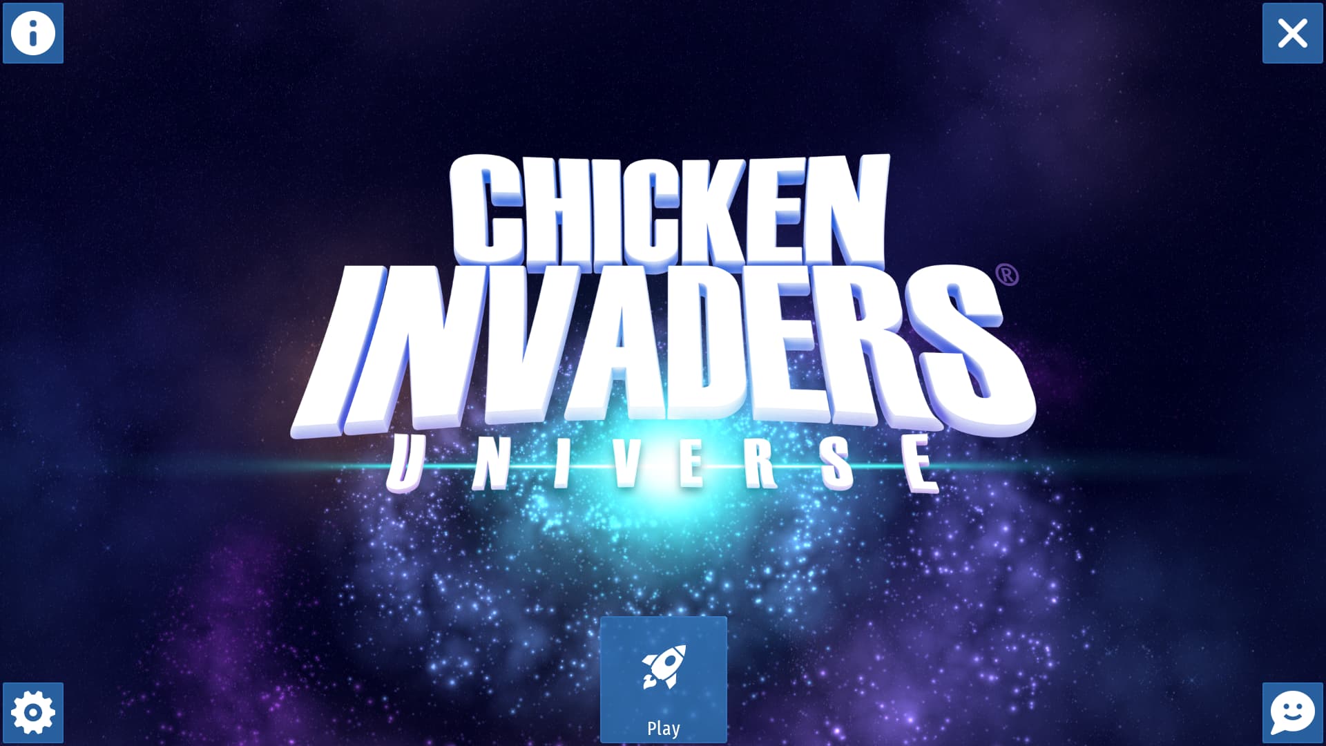
Now let’s see my main screen redesign again:

Now that we’ve enstablished the layout, let’s go into more deteils:

  • As I stated before, the forum button has been removed or it could be included in the socials tab, along the other socials buttons (which is located in the bottom right corner). The options button takes the position of the forum button and it only shows the gear icon. Thus leaving the play button at the exact center (and under the title), as it should be.

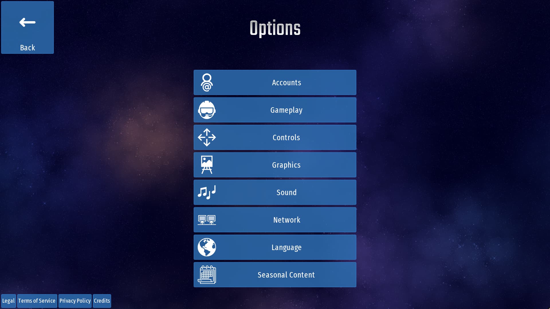
  • The info button (located at the upper left corner) could contain all the legal buttons plus the credits button and a new button called “Version”. which, as you can guess, shows the version of the game there. It’s important to note that while all the buttons mentioned could also be placed inside the options tab, they’re not exactly “options” but rather “information” or “info”, so having a dedicated tab just for them would be much more fitting in my opinion.

  • Lastly there is the socials button, which I’ve already explained, and the exit button, which remains unchanged.

You could argue that the menu looks a bit too minimal this way, especially the play button, which is a bit too small. So if you still prefer the big old play button, I made other two redesigns just for that:

Big old play button at the center

Big old play button at the bottom center

Again, I’m not saying that should be exactly 1 to 1 to these; they’re just exemples of how it could be layed out.

If you still think that it looks too minimal then I also have an alternative design with a bit more stuff:

This one retains the socials buttons as they currently are, and move all the other buttons of the corners in the bottom left corner, to kinda make them equal to the socials buttons, plus the big old play button at the bottom center.

Ultimately it all comes down to preferences, but the options are there. I gave more than enough tips on how it could be done.

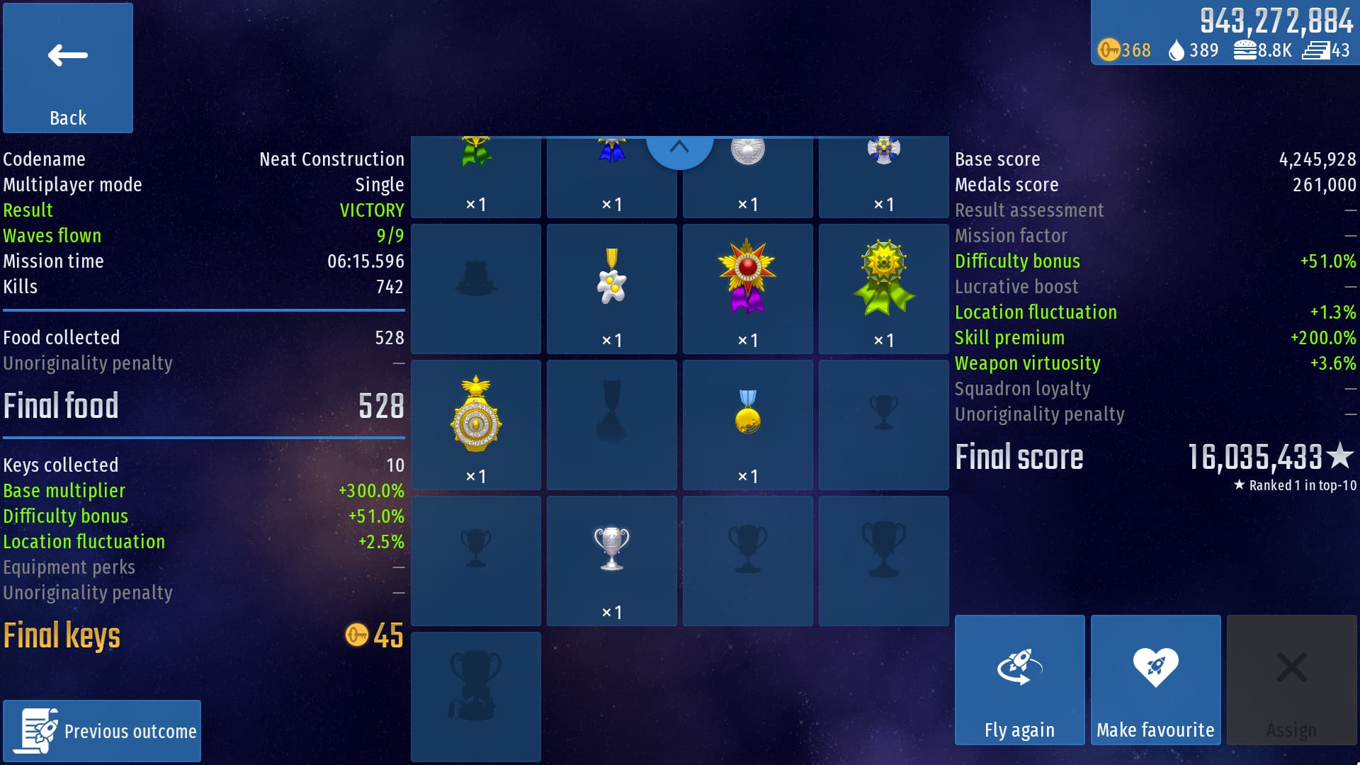
Resoult Screen Redesign

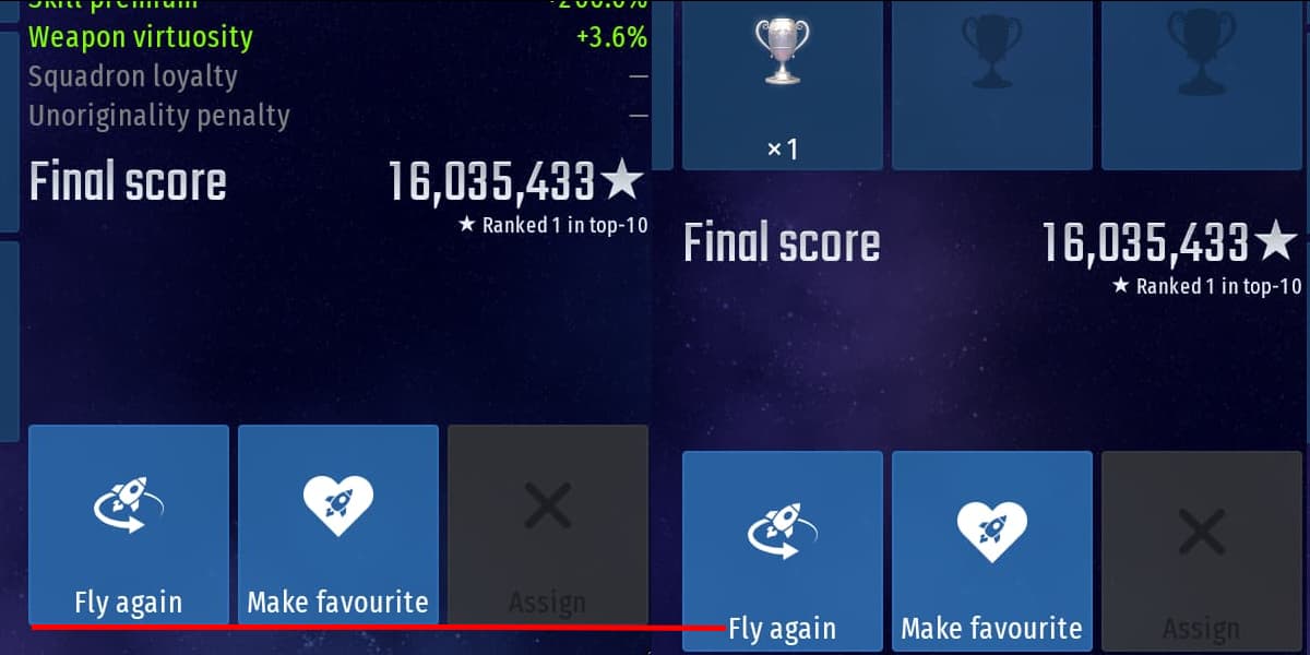
Another screen I’ve always found kinda off was the resoult screen. I especially don’t like how the elite trophy frame is left on a new row alone, and the fact you have to scroll just a little bit to view a row and half:

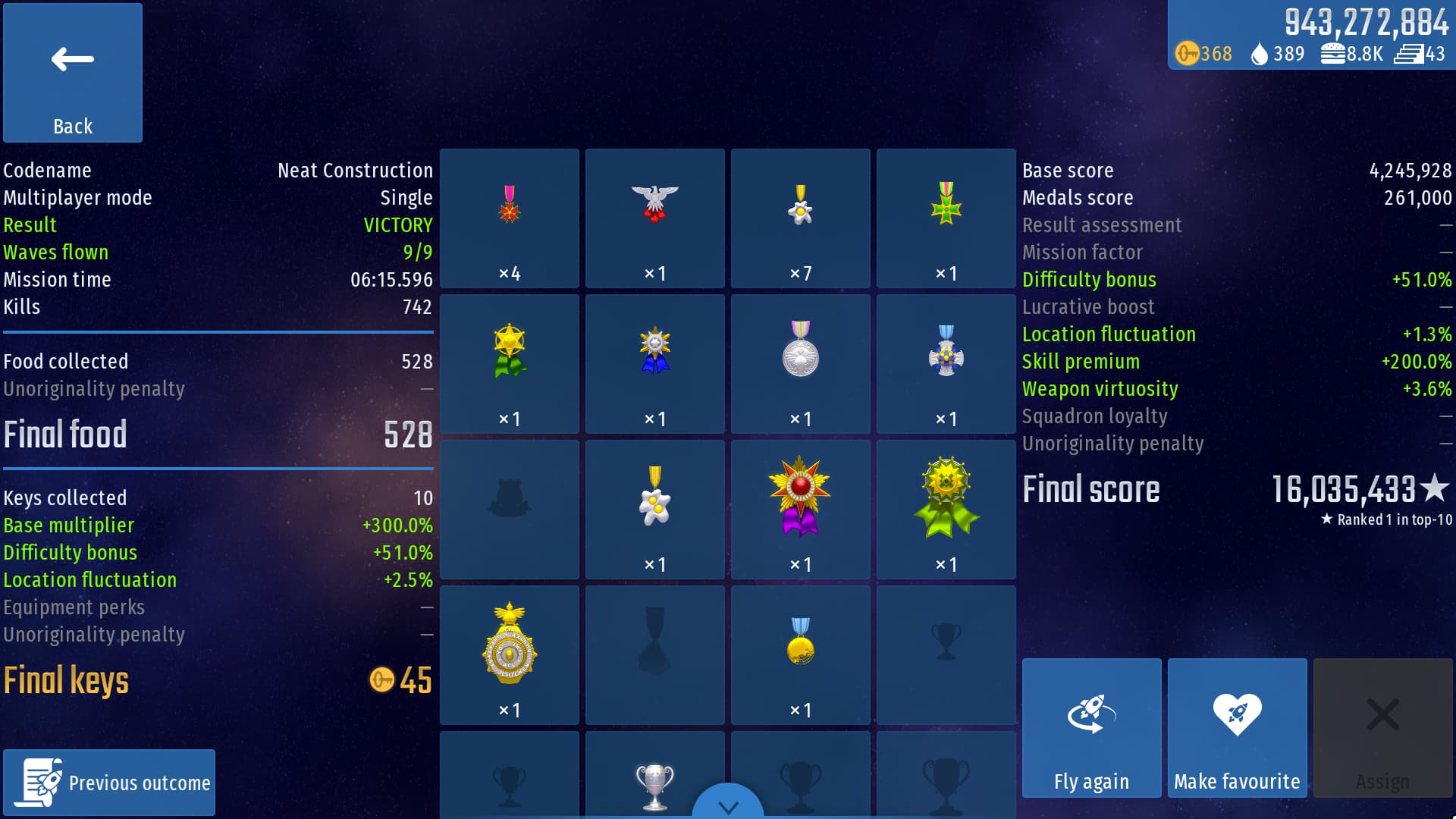
So what if there was a way to make it so that it shows all the medals on the same screen, by keeping all the current frames and text sizes and with better frames distribution? Well… turns out that is not possible, but I can still say that I tried. Here’s my attempt at the resoult screen redesign:

I basically thought that if the frames were distributed horizontally instead of vertically. then they could’ve fitted all in one screen without the need to scroll, kinda like the CI5 resoult screen at the end of each chapter. That could have worked if it wasn’t for that damn elite trophy. Other than that I see how people would not like this design, even if it gets rid of the lines between the stats sections.

By doing some qiuck math, there are 21 frames in total; 15 medals and 6 trophies. So if you want to make the frames even you could either keep the current design and just change the collums from 4 to 3, so that they’ve 7 rows that are even and there is even more to scroll down for, or just place them randomly with different sizes in the same space, like in all the episodes and the medals tab.

The horizontal design could be liked or not, but regardless it was just an attempt on my part, so don’t take it seriously by any means.

(Also don’t know if you noticed but the buttons on the bottom right corner of the resoult screen are slightly more above the bottom part of the screen, unlike any other button of this kind in the game. Not sure if that was intentional or not, but erither way, I’m pointing it out).

Summer Edition Color Change

I find the main color for the summer edition really odd to be honest. All the other editions are perfectly on point with theyr main color, but the summer edition is just odd to me.

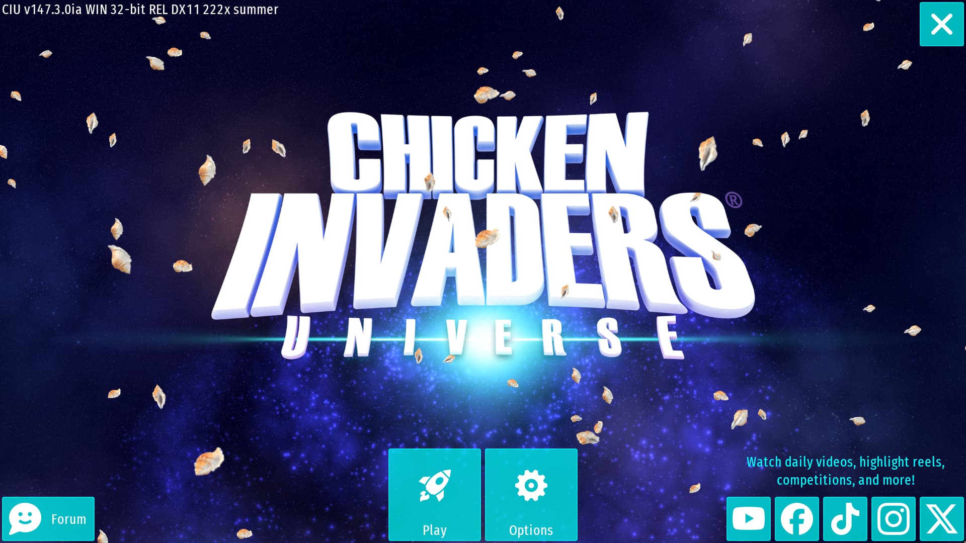
I guess the aqua color refers to the tropical beaches, with theyr crystall clear water, but this is not the color I immidately think of when I think of summer. This is the one I’m referring to:

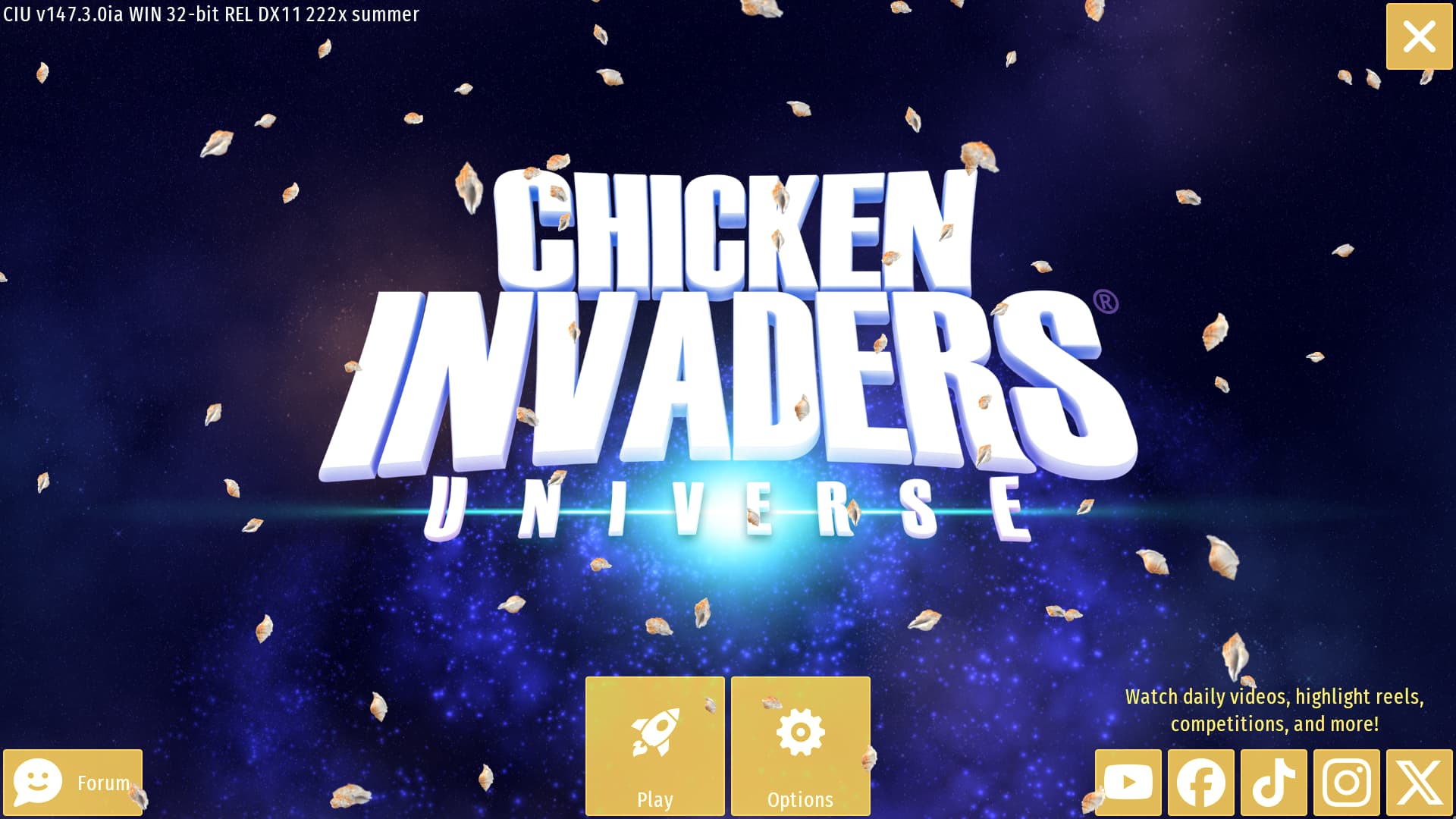
This sand color is perfectly on point for the summer edition, because it rapresent the sand, the sun, the hot sand on the beaches warmed by the sun in the hot days of summer, and the warm light emmitted by the sun during the whole day, that makes you start sweating just by thinking about it. The aqua color is just too cold to rapresent summer, and it’s already too similar to default blue color, but this sand color is just perfect on the other hand, and there is no other seasonal edition that uses this color. Also, the purple galaxy in the background makes it for a much better contrast (still don’t understeand what the purple is refering to, but oh well). Only downside is that this color makes the white text harder to read, and it also blends too much with the shells, but that’s just the nature of the color itself, and I still think it’s not really that bad. So again, if had to pick a color to rapresent the summer it would be this one for sure.


Minor Tweeks


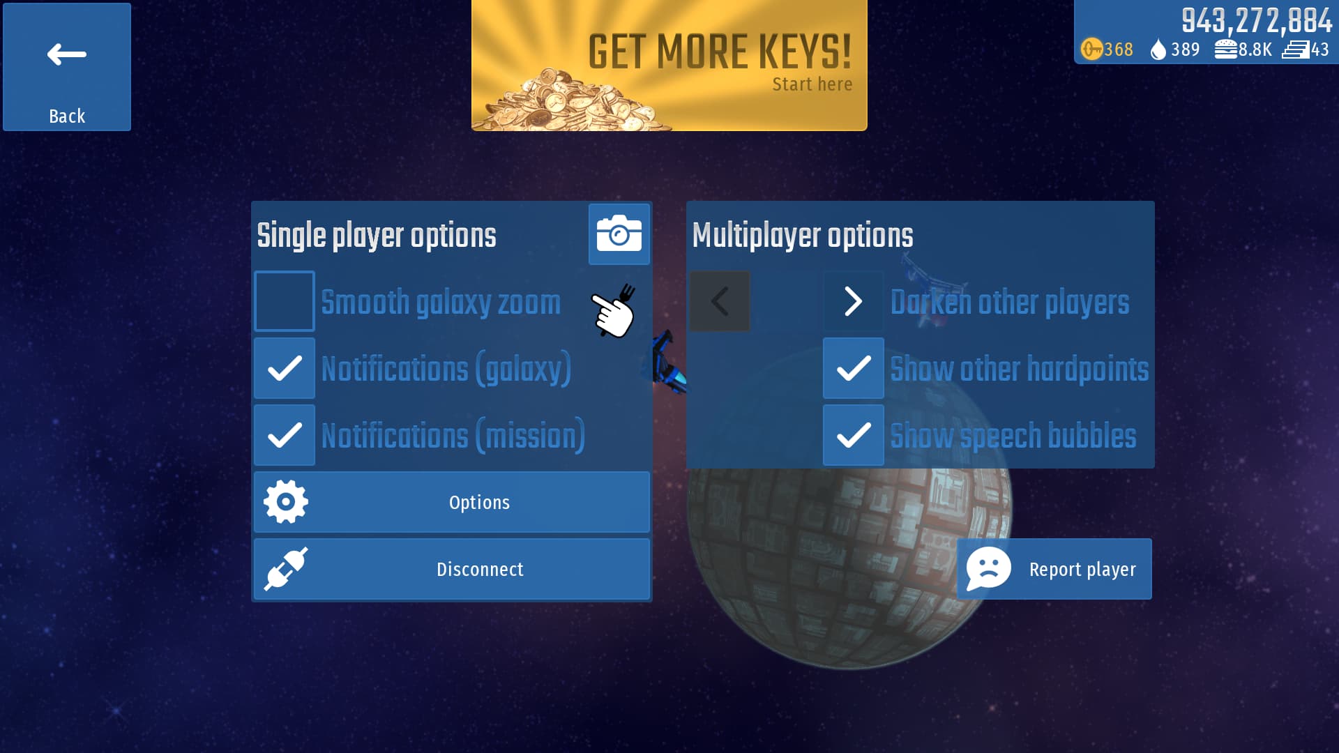
Single player options

This one is a really minor thing, so I’ll not waste too much time on this, but I basically find odd how in the options menu for the galaxy there is a text above the box for the multiplayer options to explicitely tell what they’re, but for the box on the right there is not, so I basically fixed that:

More dragging options for equipment

This is just another minor tweek but that has functionality instead of being just estetically like the previous one. I really don’t know why this is not a thing already but oh well… So basically, when you choose which equipment to put in the mission slots, you can drag them to duplicate them if you have more of the selected type and put them in other mission slots. This is handy but what if I wan to do a bit more? Like changing the slot of individaul equipment by simply dragging it out to another slot (and to duplicate them you could hold shift while dragging them to another slot, for exemple), or even unmount them by simply dragging them out of the mission slots, like this:

It’s just a minor tweek but it could help managing your loadouts much faster and precisely.


Ideas


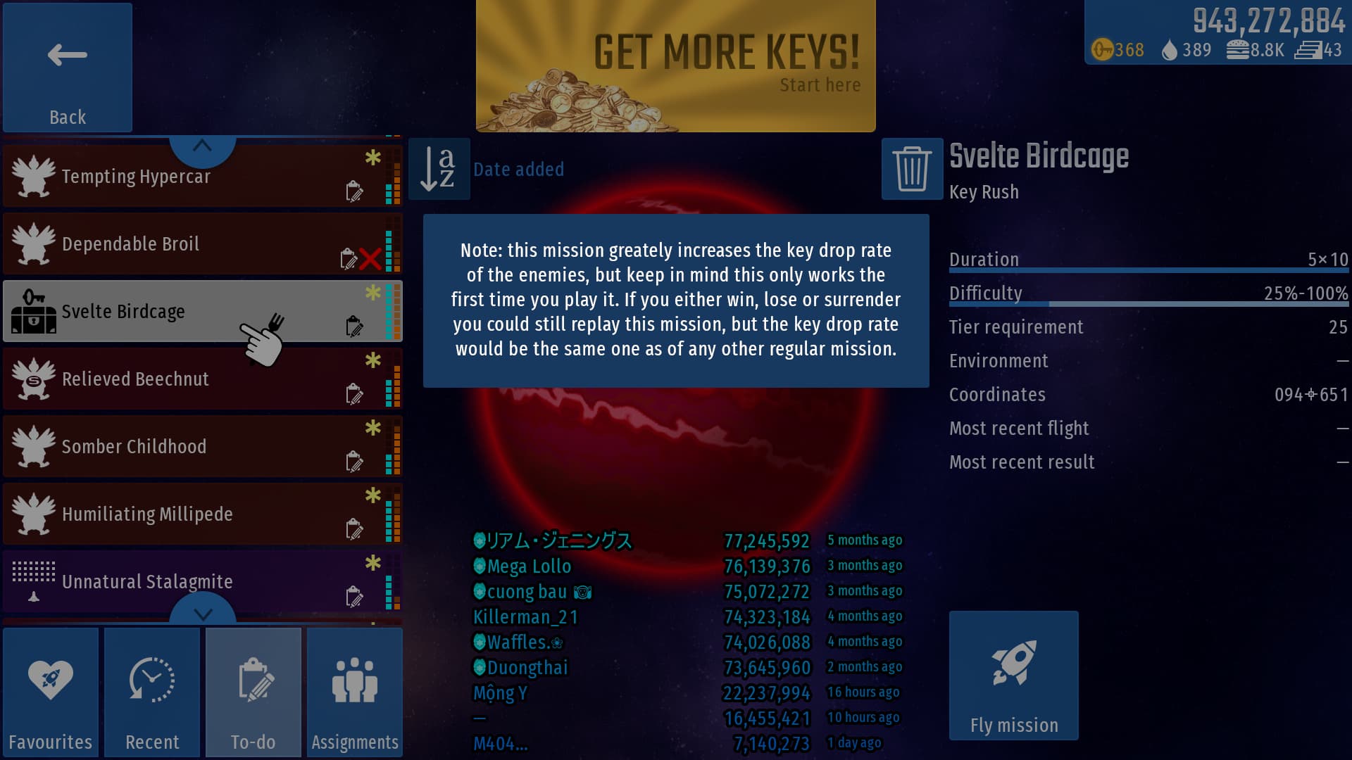
Replay Key Rush Missions like Any Other Mission (Literally)

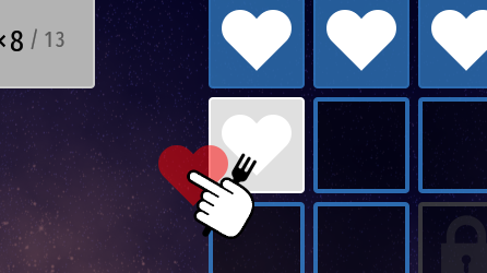
This one I’m sure is an idea that everyone will love, and it’s a simple as that: you can replay the key rush missions as many times as you want, but the increased key drop will only work the first time you play the mission. If you either win, lose or surrender, you could still replay it, but the key drop rate will be the same one as of any other regular mission. This will allow for everyone to increase theyr score in those missions, rather than being just a one off and if you fail it you’re doomed forever.

In addition to this, it would also be better to show the player a warning on screen whenever it finds a key rush mission, to inform it about all of this, like this:

Then after you played the mission, if you replay it then a text on the loadout tab could be displayed saying something like “Note: you already played this kind of mission, so it’s advantages won’t take effect anymore”, or something like that.

HUD Hitbox Visualizer

Last but not least on this massive list is an idea so crazy it could actually work, and you probably already understood it from the title; an HUD that shows the hitboxes, not just for the enemies, but for EVERYTHING; ship, food, coins, atoms, gifts, enemies, obstacles and projectiles:

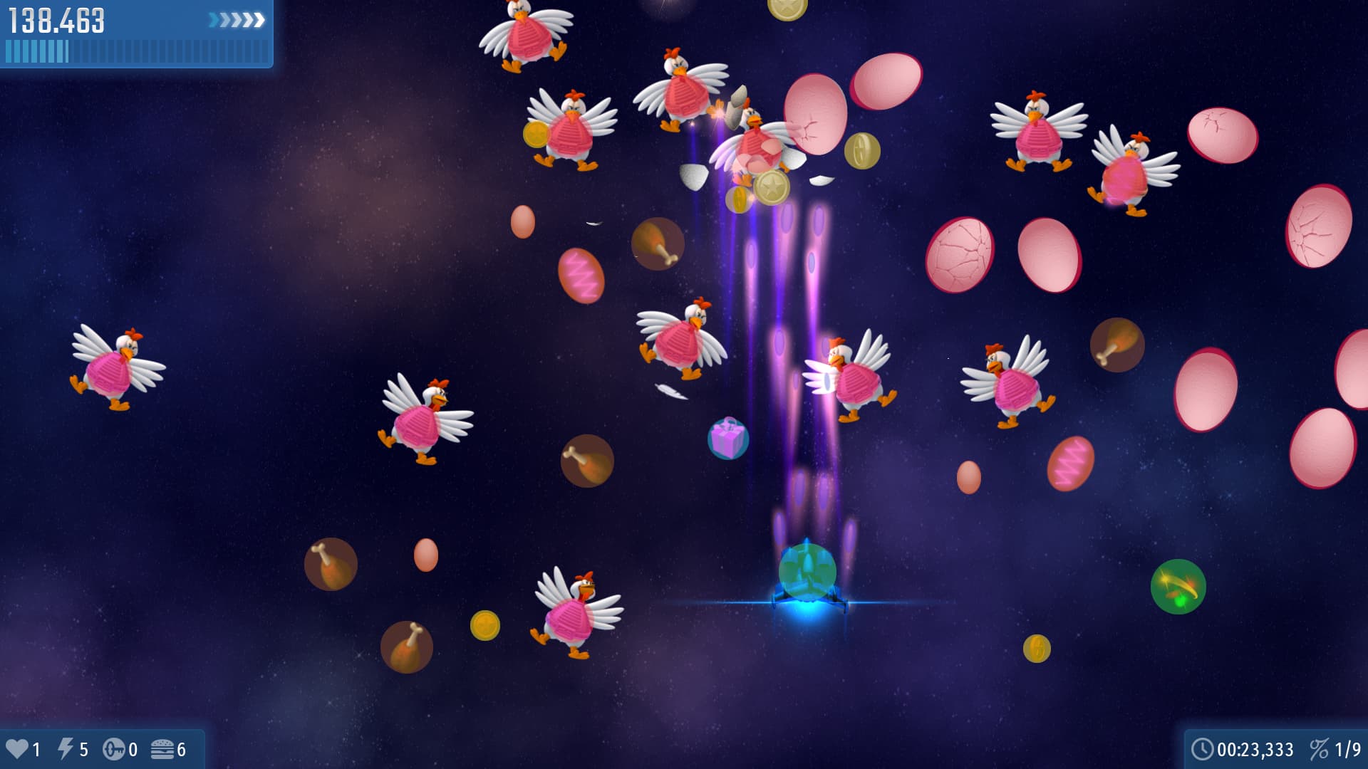
There are already tons of HUDs in the game, that show any kind of information to the player, so why not adding this one as well? I don’t think it would be that OP to be honest, and could also cause distraction depending on the situation, or just generally you don’t want to have that on all the time, so there are natural tradeoffs that makes it balanced enough.

Conclusion

After all this brain storm of suggestions and ideas, I only hope IA will take note of some of these to help him improve the game in one way or another. Ultimately it’s his game and he decides what goes in and what doesn’t, but the community can still give suggestions and feedback, and some time… miracles do happen…

With that said, I’m honestly exited to go back to this game and fianlly discover it and enjoy it more. CI is a series that is really close to my heart and while I do have a love-hate relationship with mobile free-to-play kind of games, I can’t deny that there is still something about this game that intrigues me, so hopefully I’ll get to do some more cool stuff for it and give it some help if needed.

As always feel free to share your opinions about everything I said in any kind of way you want, even the most brutal way. If you think all these suggestions suck ass just tell me with no problems; negative criticisms are way more important than positive ones, remember that, but if you like them in one way or another it is still very appreciated.

Alright, that’s enough of me typing; I consumed my keyboard. Have a good day everyone.

12 Likes

Because these two are the ones which are used the most. Even if you set your settings once, you still periodically tweak the sensitivity or change accounts, or turn fps display on and off. You don’t do this with any other button.

Yes, it is, because no other mobile game (especially not angry birds) depends on the forum feedback as much as CIU.

I’ve never seen anyone having troubles with that, though, not even in Google Play comments which are remarkable for the inability to find something.

The CIU socials is a separate case because the main action is still happening on the forum (which I am very grateful for because out of 5 socials 3 (IFX) are blocked in Russia and 1 (TikTok) is not functioning properly with regional locks they introduced themselves).

Because that’s not an “Option” that can be tweaked. And because nobody clicks these.

No.

Yes (maybe).

I honestly do not understand why people remove texts from their buttons. Windows 11 is a great example of why this should not be done, even though the icons they provided instead are clear and understandable.

Which will not be in the centre anyway because of the camera zone in modern phones, and weird screen ratios. Besides, even though you’ve centered, you made it significantly smaller, which would be more annoying than having it next to the options.

Another example of why you should not remove the text. To me that icon looks like it would only contain this (or the simplest “how to play”):

Moreover, you put all the square buttons too close to corners, where even good phones sometimes have troubles detecting the touch. This is not a problem in the current design because the exit button is supposed to be clicked with enough intention, and the socials are packed in a strip.

Only solves the small button being annoying.

This could theoretically work but it simply looks off with empty space at the top to me.

Result*

Readability problems because instead of being split into two sections all the text is now in 5 separate zones. Not that more than 2000 active players would actually care about reading the medals, and the top 50 would automatically count what they got and how much (somehow).

And this is the one I’m thinking of:
изображение
I’m sure many people have different associations with summer.

This is a completely separate problem for a very long time which was tweaked a bit fairly recently.

This would resoult in people asking where the single player mode is.

Especially on phones. I’d like to see them being put as long as you hold the item above the cells, like in minecraft’s inventory.

Read the title only, but this was suggested at least 5 times, in different ways, and it’s still not added, so I wouldn’t hope for it to be.

Their.

Already in-game, technically, in the debug mode that’s currently entirely removed from the release builds, which is sad but understandable.

You should also pay attention to the enemy health HUD, because it does not show values for health, only a health bar, and there is a very serious reason behind that: it’s giving less opportunity for cheating.

(I can already see KnockoffFeline typing out a second wall of text)

4 Likes

Haha, made you type that, I guess :​p

In any case, welcome back, Madder, I’m glad to see you again! Here’s my review of your suggested modifications:

The design I like the least is the alternative design (i.e., the last one). I’d rather not waste a couple of seconds restarting the game after missing the settings button and clicking the close button. That button layout is no good. It would be best if the close button had its own little area, like in your other designs.
You made the right call on keeping the social buttons as they are, though, as I firmly believe iA wants to keep them as they are.

The design you showed first didn’t make me go “wtf” at all, don’t worry. It’s just that I don’t like how ironically small the “Play” button is compared to all the other examples you showed. Ironic, because it’s “the most important button”, as you said.

The big play button at the center might work because the bottom margin would be uniform with certain iPhone models, which is cool.

However, I like the design with the big play button at the bottom center the most. While I’m aware that your designs are just examples and you don’t expect them to be implemented as is, there still are some adjustments to be made to it in my opinion:

  • Assuming the version info stays on the main menu – which I wouldn’t say is “so right in your face” since it’s just relaxing in the corner – the “Settings” button should be moved to the top left corner which would make more sense than having a button next to it that just leads to legal info and some other links. But if you insist that you don’t want to see the version info on the main menu, then it could be moved to the settings menu or the credits screen, just like in other iA games.

  • Speaking of, trueuser has said before that the legal info and credits button can fit in the settings menu, and I agree with him. I’d leave them as they are. Then the proposed info button would be pretty much useless as it would only contain two links. Therefore, I’m against having a separate info button. Instead, I’d put the “Forum” button at the bottom left corner.

Other things that would be nice to have

  • As some people prefer, the “Accounts” button should return to the main menu, and I agree too. I’d place it below the “Forum” button.

  • The social buttons should remain unchanged as you showed in the alternate design.

  • I prefer to see captions for most buttons over the overly minimalistic approach you took for the redesign.

That looks cluttered. Allow me to remind you that the top area being reserved is not unintentional. Specifically, ads could be displayed there.

On a positive note, I do want to thank you for bringing this up. Eventually, I would like to redesign the middle column to be more compact so that it fits all the medals on a single screen.

They are? Are you sure that it’s not the opposite (i.e., there’s no bottom margin in your mockup screen)?

I think this looks a bit like Thanksgiving:

The box on the right is still the “Multiplayer options”. Surely, you meant the box on the left, yes?

Okay, maybe don’t show collection areas of collectibles, but otherwise, what Taubsi said in CID.


That is all. Thank you for listening to my TED talk.

2 Likes

Welp, as expeted I got a shitton of responds, so I’ll do my best to answear them all.

I get the importance of the options button but what I meant is that literally no other game has the options button right next to play button like in CIU.

Ok, that’s a fair point, but if that’s the case, then why did IA himself told me he planned on possibly remove it?

I just meant what I said in the first reply.

Well I mean yea; the CIU forum is the only real social for CIU. The CIU pages on the other socials are just for pubblicity. So if anything I see why the socials buttons and the forum button should be separated as they’re.

Yes, that’s exactly what I just said a few lines later:

What “no”? I just removed it for that exemple. Don’t take it seriously.

Well this is the second time I propose this:

Don’t get what you mean with Windows 11 but ultimately it’s just a common design choice, esepcially for mobile games.

I mainly meant that as long as the play button is centered vertically that would already be fine. You could say the same thing for any other mobile game, yet the majority of them still have the play button at the center (at least vertically). As for the button size, I just stuck with the default CIU buttons sizes, of course I think it’s way too small as it is. It could be done in many different ways, but if we want to stuck to the default CIU buttons look then those ones are the only ways to do it. Also I personally don’t see how the options button could make find the play button easier rather than just leave the play buttom at the center like in any other mobile game.

I mean yea, the icon is kinda ambigous, but it’s not like other mobile games haven’t added it regardless. It would just be a way to organize the elements a bit better, but again, that’s just my opinion and this was just an exemple. And besides, the text could still be moved to another place, not necessarly in a button like that.

That’s a good point, especially since of modern phones have rounded corners, and unless you’ve anabled letterbox on graphic options, that could create problems depending on the phone model. Also the exit button doesn’t show up in the mobile version.

I mean yea, that’s the point, as described above.

That’s because you gotten so used so the current CIU main screen design, but regardless, again, it was just an exemple; it can be tweeked at will.

Ah… mah bad…

Yea; I admitted myself that this redesign is not the best, but it was just an attempt to make a screen that was designed to be vertical into horizontal, and of course the transition doesn’t always happens smoothly, but I couldn’t come up with a better way to do it. Still though, it was worth a shot.

I didn’t mean to say that my personal favorite summer color should be implemented, I just came up with a color that could fit the summer edition a lot better than the current one, as I described in deteils in that section.

2 things.

  • First: you didn’t described why this color makes you think about summer, like I did for the color I proposed. And returing to what I said before, the point of the prhase was to describe why that color (objectively) could fit for the summer edition, not to say I personally like it more, even if I say that indirectly. It’s hard to explain but I think you got my point.

  • Second: that one exact color is already used for the easter edition.

I don’t get what you mean (the tweaked part, I mean).

Single player mode is simply playing missions alone, not like a story campain like in the episodes. The options on the left box are for the individual player, while the ones on the right box are for the multiplayer. I just thought of making it a bit more clear with this minor tweek.

And besides…

You just wrote “resoult” after you corrected be by saying it’s written “result” lol.

This was just an idea, again, don’t take it seriously. Anyway, I found it would be more natural to just be able to drag the individaul equipment from one slot to another by default, rather then duplicate them. The ability to hold shift to duplicate them could may as well be just an additional feature that’s PC exclusive, like the ability to access the translation tab; you can’t do that on phone, but people just live with it.

Well I didn’t know, but regardless, it is still worth trying; you never know, it may actually happen at some point.

Again, mah bad…

I’ll take that as “It’s already in the game, but not available for anyone except the developer”, so it’s not in the game at all, basically.

Never actually thought about that, but yeah, it’s basically just a visaul thing, and this hitbox HUD falls into the same category.

Yep, you called it.

Thanks KnockoffFeline, glad to see you again too! I’m greatful to you and all some of members in the Discord server for the warm welcome back; I appreciate it a lot.

Alright, your turn for replies now.

There isn’t anything to replay to in this section as you already replied yourself (I still did it and I wasted everyones’ time…)

Already replied in a previous reply:

As for the button size, I just stuck with the default CIU buttons sizes, of course I think it’s way too small as it is. It could be done in many different ways, but if we want to stuck to the default CIU buttons look then those ones are the only ways to do it.

Again, it depends from phone to phone; models and resolutions mainly.

If the version text stays where it is, the top left corner is already occupied by it. Perhaps you meant the bottom left corner, like in my initial redesigns. Also about the last part I kinda agree but apperently a lot of people really want the version text to stay as it is so…

Again, this is my reply to this part:

The accounts button is just an option at the end of the day, like all the other ones, so I personally prefer it as it is now. And I mean, it’s just one extra click, and it’s above all the other options, is it really so annoing that you want the accounts button back at the main screen?

That’s just personal preference, and as I said before:

it’s just a common design choice, esepcially for mobile games.

Yea, I forgot about that, and yes, I’ve already said that redesign is indeed not really great.

As I said, the best way to do so would be to change the collumns from 4 to 3, but that would left a lof of white space around the middle part, unless you extend the legth of the stats, but I don’t think it would look great. Still though, it is worth a try.

Yes because I fixed them in my mockup (and also got rid of the mouse in the bottom right corner, like in every mockup I made, if you never noticed). Just take a look at the main screen buttons and you’ll they have a margin of 4 pixels from the bottom, and the same distance applies for the vertical sides of the screen, so the buttons on the resoult screen are most certainly an overlook.

Well not that much really. Thanksgiving main color is brown, which is perfect since that one is the color that perfecly rapresent the autumn because of the leafs, woods, mushrooms and pumpkings (either that or orange, which is basically a more saturated brown). That tonality of yellow fits perfectly for the summer edition because of the reasons I described above, but still, they don’t really look that similar. Yellow and brown/orange are really close to the color spectrum, but in this case they still differenciate enough. If anything, as I’ve already said, the current color for the summer edition is too similar to the default blue color for the standard edition, so if anything that one has more reasons to be changed.

Yep, mah bad…

Well collectibles have an hitbox as well (or rather a bounding box), so they still count in my opinion.

Thanks to you and and to VerMishelb for exaustive feedback, it’s always appreciated.

I end this skyscraper of text in the hope to have cleared some doubts, but if you still have things to ask feel free to teel me.

2 Likes

Pardon me replying to only the last post. I’ve read all others, but don’t want to reply to them all so just gonna join the last.

I get the use of literally for strengthening the argument (god knows I also do it) even though it’s not always 100%, but in your case this is really not true so you shouldn’t use that.
Here 2 games that I have installed:
Celeste (at first boot it has a splashscreen, but the logo could just be placed in menu so no big deal):


You can ignore the PICO-8 because it’s an unlockable play mode which you can skip so it doesn’t show in the menu.

And Worms Armageddon (the question marks are the options menu):

IA just said he considers possibly removing it. It’s extremely vague even for IA. Could just be something he thought about for few minutes.

Honest question. Did anybody had troubles finding the play button in CIU? I feel like if a big button with “Play” text written on it is too hard to find then it’s a literacy problem not a design one.

But why do it at all? On FHD screen all the things are placed in such a way that scrolling is not needed. Or at least would be if IA presumably didn’t insist on showing all the trophies: Mission complete screen

40 Summer Color Palettes to Vitalize Your Creative Output

#JusticeForPlanetaryMissions


Excluding those things above. I do agree with removing the version info from main menu. It can just show in the options screen and it would look better. The account button should also stay in the options menu.

2 Likes

No, that’s because the empty design always looks off. I have an installer of v2 if you want, it has way less at the title screen and yes, this looks off.

That’s an oops, I didn’t even check.

Introduction of high contrast mode and the default font colour being changed to something a bit darker for better readability.

That was supposed to be a joke to soften up my wall of counter complaints.

I’m pretty sure that making a mod that draws hitboxes around enemies would be considered as an unfair advantage and I really doubt iA would expose the hitboxes to every single player because of the aforementioned potential cheating target. You’d be able to track the size of the circle, at least, and target that.

“No other game does this” is a weak argumentation to change something that already works well (except for accounts, I want the accounts button back at the main menu :frowning: )

Idk.

The “common design choice” ruined so many things out there, though, because that “common” wasn’t simply what was needed.

Right click in the file explorer brings small square icons at the top of the menu with Copy, Cut, Paste, Rename buttons instead of what was working fine for at least 30 years.

2 Likes

Well… I asked for it, so here comes the second round.

Sorry, let my rephrase then: “I can’t think of any game that has the options button right next to play button like in CIU, not that I know, at least”. Hope this would be better.

Pardon, but these two games are really bad exemples for your counter argument, and I explain why:

Celeste has always been a game for consoles and PC, not for mobile, so the layout is of course really different than the CIU one or really any other exemple of mobile games main screen I showed in the first post, because of course the UI it’s not design for touch screens. CIU is for both PC and mobile, so of course it’s UI does take the thouch screen into account.

This exemple is even worse because it has a completely different design than traditional mobile games main screen. I don’t really know if this screen in particular is from PC, consoles or mobile, because I never played worms in my life, but I can say that the buttons are big for sure, so it could also work on mobile, but still, it’s a very unusual design for a main screen compared to my previous exemples. The buttons rely entierly on pictures, not even icons or text; only after you select them a small text at the bottom tells you what those buttons are for. And to top it off:

This is a really strange and unusual designfor an options buttons. Like “a bunch of questions marks”?.. I would guess at first glance it’s some sort of “random mode” or perhaps a “how to play” or other kinds of tutorial or explenation about the game. I never would have guessed that button was for the options if you didn’t tell me, but even if I played myself and then clicked on it or read the text, I would have still gone like “Ah… this… is the options button… good to know (I guess…)”. If there was like a worm with a wrench or something like that I would’ve immidiately thought “Ok, so I assume this is the options button”.

Regardless of design choices, it varies from game to game, and in CIU case, it’s main screen is mainly designed for PC and mobile, and it’s very similar to other mobile games, so may as well make it “standardized”. This is not because I want CIU to lose it’s identity and become more similar to other mobile games or anything like that, I just think it would make the main screen cleaner and more intuitive, that’s it.

If he did thought that there must have been a reason for it. Perhaps even him found it a bit unnecessary at some point, but this is just pure speculation.

I meant that I just I found it unnecessary to have the options button as big as the play button, in the context of the CIU main screen and general mobile mobile games main screen design.

Yes. Kinda of thinking of it, it’s all for those goddamn throphies slots that makes the the slots uneven and make you scroll down a bit just to see the full thing. And speaking of which:

Dude, that is SO GOOD! It basically fixes everything wrong with the current resoult screen (except the buttons hight at the bottom right corener, but eh). I especially love the “don’t show medals or trophies you can’t get in the mission you just played”. Perhaps only the thropy part could be changed, like indeed; just show the thropy you get for that mission depending on the difficulty, so from 6 slots they become only 1 and suddenly they’re even and you don’t even need to scroll down; problem solved. As for the medals, I think most of them can still be obtained in every kind of mission in one way or another. Perhaps it will not have sense to view the appetite medals for the comet chase missions, since you can’t food in them in any way, but it is very specific depending on the mission type and there’re very few cases like this, and besides, it will ruin the frames layout, so I think this rule should apply for the trophies only (in my opinion). And I also totally agree on highlightning the food and final scrore stats. I get that the keys are golden so it fits more for them and not much for the other stats, but I kinda like that as well. So yeah, IA, take note (please…).

I mean I get that the current color for the summer edition refers to the tropical beaches water, but I feel like a warm color would fit better for the summer edition. Then again, christmas edition has red, and I find it fitting, and it’s a warm color, but there is a little difference, wich is that that christmas edition is not winter edition, in wich case celeste like color would have fitted better, but it is the christmas edition, and christmas has an entierly different color scheme than just regular winter, so the red in that case does fit well. Summer on the other hand is not really an holliday, but just a season, and the season itself it’s hot so I repeat what I said; I think that a warm color fits it better, that’s it.

Don’t worry, I’m sure they will come at some point; IA said he would like to make them some time in the future. We don’t know when or even if they will come up, but the chances are there so there’s hope for them.

Ngl, it’s kinda refreshing to see someone that agrees with me on those two things that VerMishelb is completely against (again, it’s just personal preferences).

Kinda perfectly continuing with the previous reply, this is just your own personal opinion. As you can see, I’m not the only one who finds it cleaner without the info text in it.

I mean sure; the leafs of plants in the campaigns being hitted by the sun is kinda understeandable, but you know; when people think about summer they think about sun, beach and sea. The leaf green color is more fitting for spring, because it’s the season where nature awakens, so trees, plants, flowers, grass and so on. Kinda of thinking about it, even though easter edition uses this color, the edition is about the holiday, not the season itself. For easter I would think of a more fancy color, like pink or cyan, but eh, the current color for it doesn’t bother me that much unlike summer edition tbh, so whatever.

lol.

Oh ok.

Ah so that was intentional (I guess…). And yes you did a lot of complaints about most of my suggestions, but that’s totally fine; I specifically asked to do that freely, and besides, most of them were vaild enough (and other ones… not so much, but still).

That’s a really fair point; measuring individual pixels is not hard, and once you know the exact values it would be easy to modify them at will, but still, any kind of cheat will resoult in instant ban, so I don’t think how that would change anything tbh. And besides, he already kind of approved it, even if in his own way, so I don’t really think is that unlikely to be implemented somehow:

I repeat my previous rephrase: “I can’t think of any game that has the options button right next to play button like in CIU, not that I know, at least”. Hope this would be better.

Again, this is just personal preference; some people will agree, some will not.

Ah yeah, you’re right. I completely forgot about that because I installed StartAll Back, which basically fix everything wrong with Windows 11 taskbar, start menu and file explores, including the option to not only resotirng the old options menu from Windows 10, but to even make it look on theme with Windows 11. And it even has support for Windows 7 themes for those if you prefer them. Sadly no Windows XP though. Here are some exemples of how it looks btw:

I can definetely reccomend it, it makes Windows 11 actually look good.

But yeah, as pointed out by you, the default Windows 11 is complete shit; too convoluted in the start menu and way too minimal in the options menu and left mouse button menu (I have a program that fixes that as well, can’t remember what it was though; perhaps powertoys, but I’m not sure).

Either way, thank you guys so much again for you feedback and replies. Again, if anyone has more to add then go ahead; I’m getting used to it by now.

1 Like

Not “any”, as it turns out. Many of those that result in a ban or kick nowadays were reported by forum users after trying them out by themselves. There must be something that’s missed.

Guess that heavily depends on where you live. The closest sea is around 800-1000 km away from where I usually live, any direction. I usually spend my summer at the village which doesn’t really have any beaches, therefore my associations with summer are absolutely not related to the sea.

More pictures because I like taking photos. Lost a lot of these after the HDD died.

Summer


Autumn

Moreover, spring, unlike summer, doesn’t really have much berries.

3 Likes

Well with this mindest then the point indicator should be unfair too because it gives the player the exact value of damage inflicted. I get that the hitboxes and bounding boxes can technically be measured, while the other huds or just approximately accurate in most cases, but still, I’m sure there must be a way to implement it and make it less vulnerable to cheating tactics.

Well yea, I never thought of how people who live in some countires that are really far from sea don’t certainly associate summer with beaches and sea. I live at like, literally 100 meters away from the sea (even though the beach isn’t really anything special), so to me it was just normal to associate summer with that.

In this case though the point is to use a color that fit the editon thematically, and it basically revoles around what people associate it with the most or just generally found fitting in one way or another. For exemple, in Italy we don’t celebrate thanksgiving at all (or halloween, for that matter), but I still find the colors for theyr CI edition perfectly fitting for them. Well ok, maybe for halloween I would think of like purple or dark blue to represent the spooky and/or the dark night. All green just looks like a retro invaders event, but still, at the same time I don’t think it’s too out of place eaither, so I don’t mind it that much. As for thanksgiving, it still takes place in autumn, so even if I don’t know what the holiday is about, it still makes me think at the dry leafs, the woods, the mushrooms, the pumpkings. Even if we don’t have anything of that where I leave, I still know they exist and theyr context, so I find the color for the thanksgiving edition really fitting regardless. And for what I know, thanksgiving is basically all about turkeys and pumpkings, so they generally stick with the autumn theme.

The point is that even though everyone has theyr own interpretations about seasons and holidays, in this context we have to use what’s most “standardized”, and I’m sorry to say it but, beaches and sea are what is generally associated with summer by most people. It would be like saying that in your opinion red doesn’t fit the christmas edition because it’s not celebrated in your country. I think you got the point by now.

Btw, cool photos, but they honestly don’t make me personally think about summer, nor I think many others will but idk.

Also what’s with the berries statement at the end, did I missed some context?

From the cheating point this is almost useless because this value changes only when you upgrade/downgrade your weapon, therefore searching for the memory address that could be useful is very annoying and takes longer than finding a value that changes after every hit to the set and known value. And I generally think that hitboxes (or, in fact, hit circles) should not be visible to player because it kind of ruins the immersion.

You’ve said that the image makes you think about spring instead of summer. Red currant, the plant that’s on the photo, gives berries only through July-August.

As statet by IA himself:

Oh… well that was rather cryptic to me because I’m not an expert in that, so I really had no way to know thay.

No, you misunderstood, I said that the leaf green color is more fitting for spring, not that the image itself makes me think about spring. As stated is the same phrase, I can totally get plants of berries in campaigns being hitted by the hot sun making you thinking about summer, I just meant that is an image people would not commonly associate with summer.

1 Like

This topic was automatically closed 14 days after the last reply. New replies are no longer allowed.