So IDK what to call it but this layout in like difficulty , levels & etc you see in like assignments , favorites & etc. Well I have an Idea to remodify it to keep it a lil user friendly interface!
(Note: Kinda sounds confusing but here me out!)

This is the old layout which the difficulty & the arrow bar is the same which people wanted to repeat a mission it is annoying to just scroll down to find it so I have come up with a new layout!
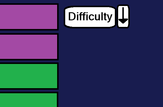
(VERY IMPORTANT NOTE: THIS IS JUST AN ILLUTRIATION NOT EXACTLY TO DO IT LIKE WHAT MY BAD DRAWING HAD DONE!)
So, as you can see the difficulty & the arrow button are now separate so people who wanted difficulty , levels & etc to appear at the top instead of always scrolling down to find it or do some challenge.
Also I forgot to add the A to Z bar which maybe IA can add like a yes or no button to do it & like z to a like that!
So @InterAction_studios do you think this a good idea  Its a bit useless but it is just some minor tweaks