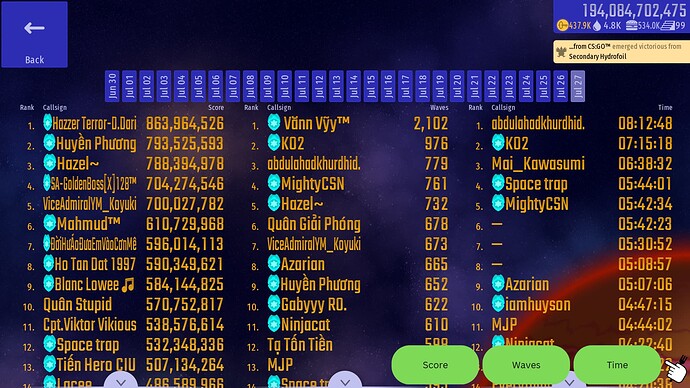
Hey, IA. Since this change is coming for the next version, I was thinking perhaps you could make another change in particular… I’m referring to the Top Pilots screen below:
Can you add three buttons so that each only shows its specific column, instead of all three columns shown at the same time? That way, you can widen each column just like you did the callsign and score ones from the All-Time Best screen.
Kinda annoying when text squeezes like in the picture above.
