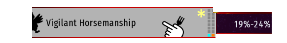
Watch the orange square. It’s just one with a difficulty from 19 to 24% seems alright.
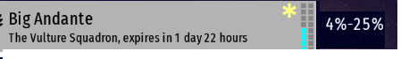
Then watch this. The difficulty could be higher, but there are no squares.
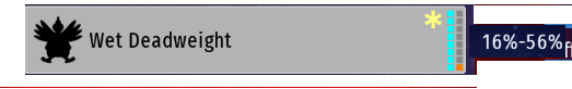
Finally, this. The difficulty could be 56% but its just one square.
What I’m saying is that this is kinda misleading, i know one can immediatly watch the percentages, but still. I suggest to have the orange squares go in accordance with the highest difficulty percentage.
So, it works that it chooses the difficulty at random?
If yes, then we can simply get rid of the lowest percentage and then it will stay the same always.
It’s because the difficulty increases after every wave, and the difficulty percentage shows the lowest and the highest difficulty in that mission. The third mission scales much more because it has a max duration.
Sorry, didn’t know that, I thought the difficulty was chones at random between those percentages. But still, the orange squares should show how difficult it can get, in my opinion
 Idea
Idea