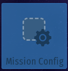
I found it a quite neater if the main options menu would be on tiles, with their corresponding icons ("?" is just a placeholder).
9 Likes
No one asked but yes

13 Likes
Honeſtly, once it’s multilingual I think adding icons would be counterproductive. It’s a lot eaſiër to read the large text than to try to decypher the icons and/or hold a magnifyïng glaſs to the ſcreen to read the text at the bottom.
2 Likes
It’s literally the same font size as the original options menu, I just cut-pasted it. There’s no need for deciphering if the icons were made generic, look at @trueuser did.
1 Like
Look at my low effort work
1 Like
Way back before Early Access I started doing icons for the options, but I quickly gave up because (i) it’s not easy to find icons that are successful at conveying the appropriate meaning (just look at how similar gameplay/control icons are on @trueuser’s mockup) and (ii) the options menu is not a place where you spend a lot of time, so beautifying it would be a waste of energy.
But I do agree icons look better. I’ve made a note to ‘iconify’ at least the main screen shortly before Early Access ends.
11 Likes
I could suggest these changes:
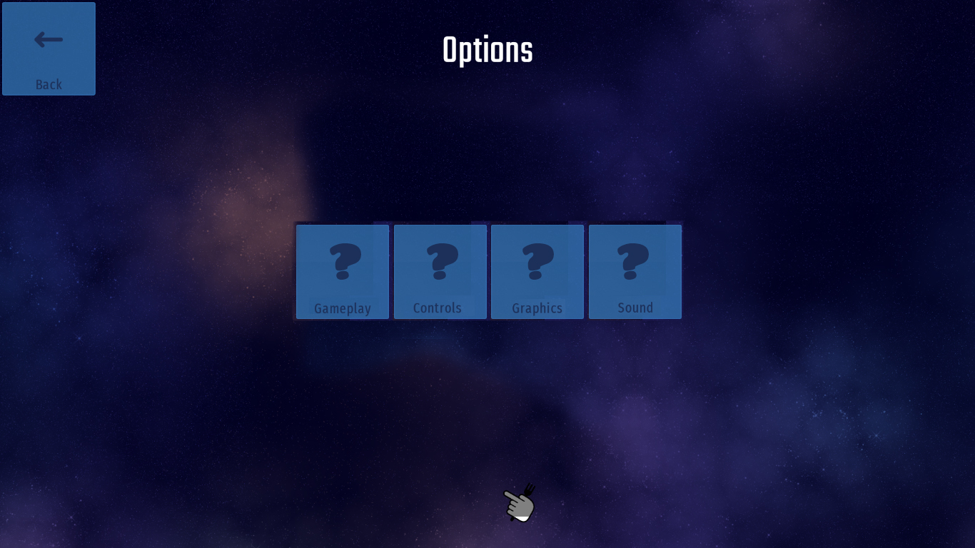
First, take away Mission Config’s icon. This will be the new icon for Gameplay Options. The premise is that rocket originally represents (or almost the same as) Save the World where all the gameplay lies.
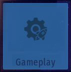
Alternative icon, also which will be as consistent as for the Mission Config ones:
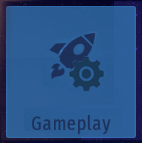
The new Mission Config icon will be this, since it is essentially all about the mission slots.
I’m sure players would appreciate this, at least a little.
5 Likes
This topic was automatically closed 14 days after the last reply. New replies are no longer allowed.