oh my god actual site feedback:
the socials icons on the chickeninvaders.com site is messed up.
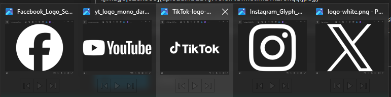
firstly: there is too much distinct colors as anyone can already tell. i have found at least one monochrome version in every brand icon pack that i have downloaded
(just picked a random variation, so youtube and tiktok might have one without text, but i dont even know anymore)
and there is no button padding which also i do not think any brand is cool with really
Clear Space
just a few examples i don’t actually have enough free time to take more screenshots
after this research i concluded that i have broken every single design guideline on my own website too, and yes 5 buttons made me write this terrifying post.
that’s it.
4 Likes
you’re turning everying into musk theme
1 Like
too bad only 2 out of 5 logos are stylized letters, and one Unicode character
in game icons are fine to me however
yeah they have something called padding
i made a mockup using icons from official branding guidelines of them
official x branding icon looks ridiculous ngl
10 Likes
Granted. Initially, I wanted to draw attention to them so they can attract some clicks/views/follows, but without the white background they do look like a bit of a mishmash.
I’ve increased the padding on the website.
10 Likes