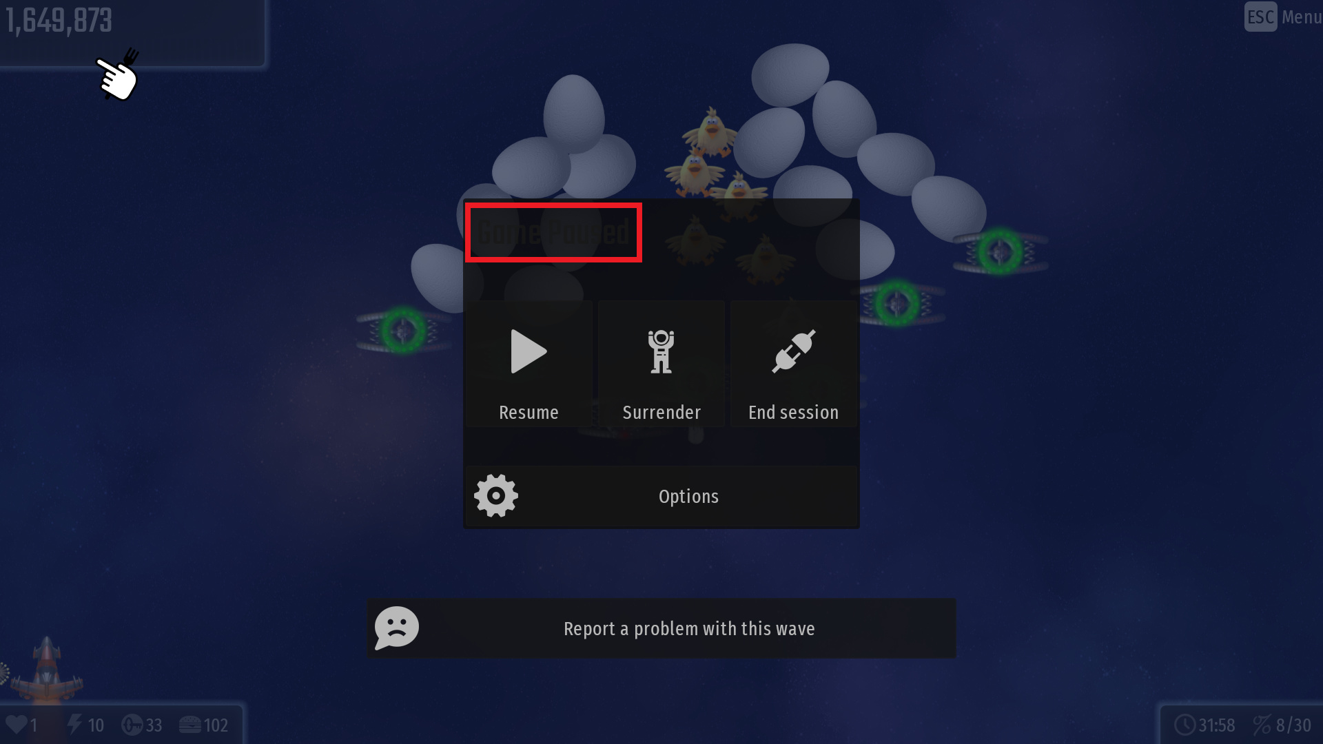
I am not sure whether this is intentional, however some user interface text remains to be of default color (dark), despite having changed the UI text color to be white to better contrast against black UI option. As a result, these texts (save for the keys as it’s always gold-colored) becomes more difficult to read. The following screenshots are the affected areas:
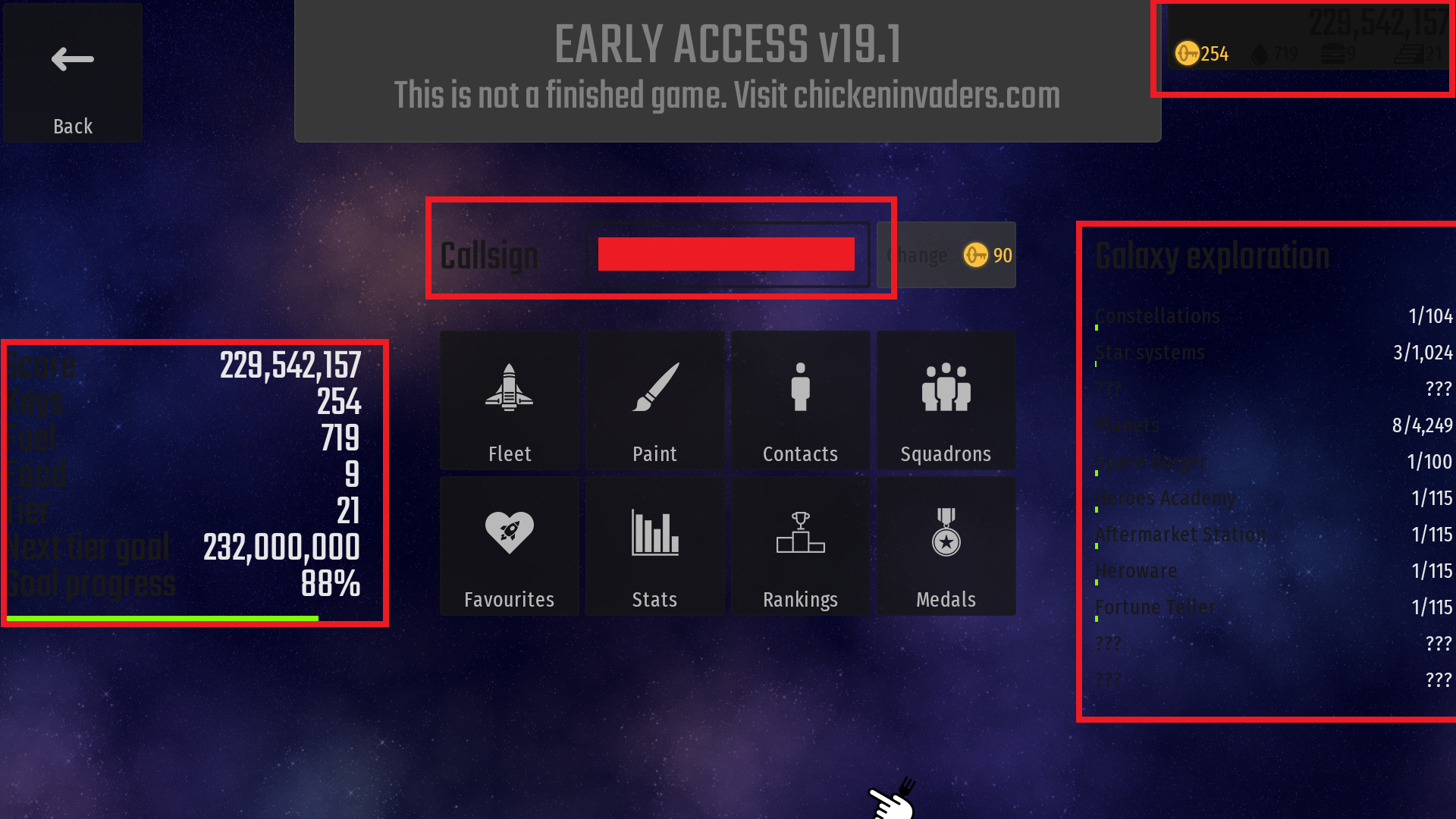
As for this one, I haven’t found out what caused this one aside from possibly changing the user interface to black, but the contrast is also rather low against black UI:
UPDATE: It turns out the affected UI text is a part of UI, instead of UI Text. So it would be affected separately from UI Text option. Which I find a bit interesting.
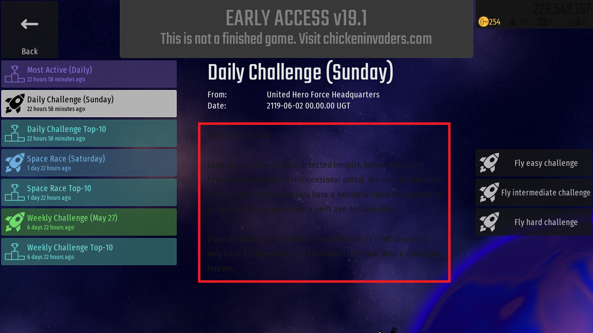
This can be addressed later, I still need to figure this one out. Be careful though as it’s placed against 2 colors; progress bar background and progress bar fill.
Unfortunately I wouldn’t recommend fixing the latter right away as the text is placed on two elements; progress bar background (as a part of UI) and progress bar fill, meaning it has to contrast well in between two colors instead of one.
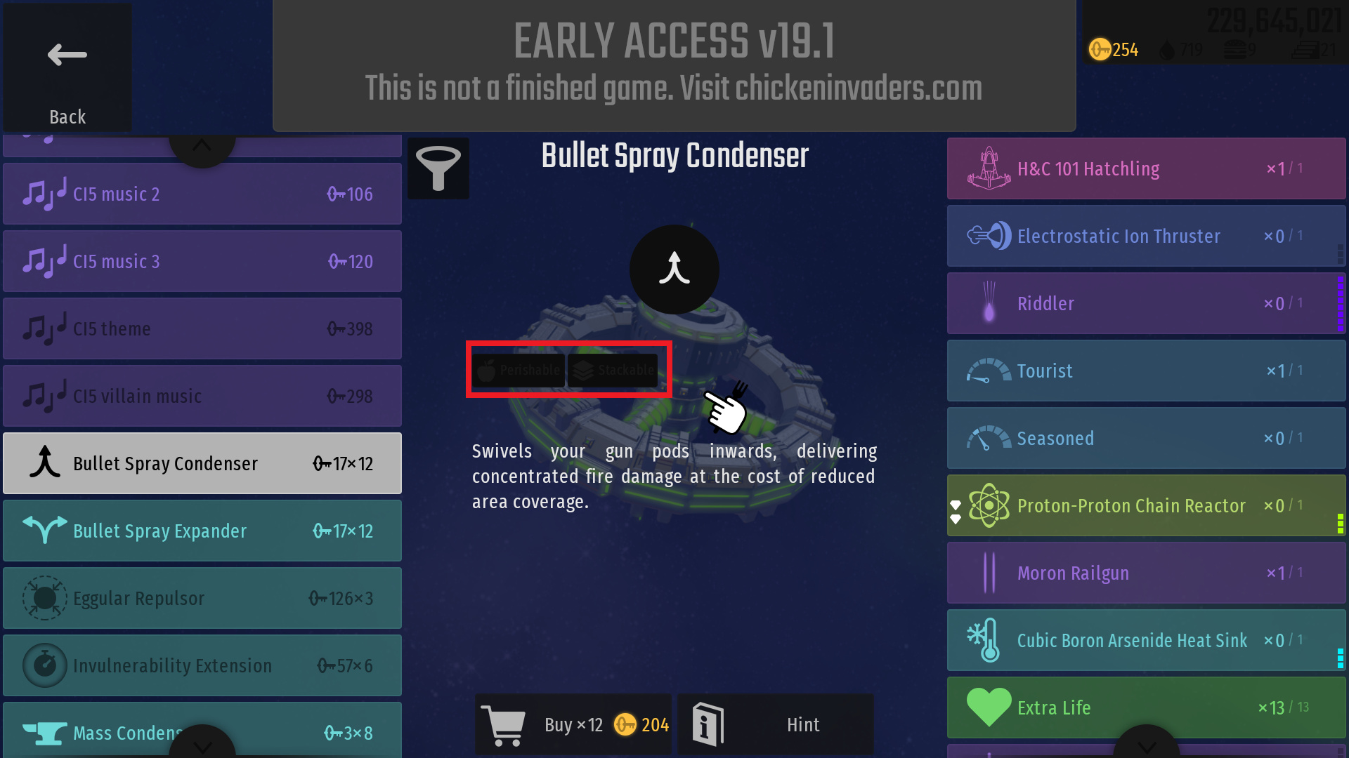
Need to research and experiment on it, at least have it addressed first.

 Bug
Bug