Hey guys, here’s a pretty big quality of life proposal I’ve got which I feel would save quite a bit of time and get you back into the battlefield: Introduce config presets to the config menu.
I use different configurations depending on the mission I’m about to do. I always use SSH on normal missions, but I use Maneuvring Jets and no special weapons in Space Race, and I bring Invulnerability Extenders and more special weapons than usual for the Ironman Competition.
I thought of this system so that I don’t have to unmount and mount a specific configuration, then unmount it and mount another. It saves time is what I’m trying to say. I also feel that it would simply be convenient for other players as well as myself.
Short version
It’s just like loadouts in TF2 (#savetf2).
Long version
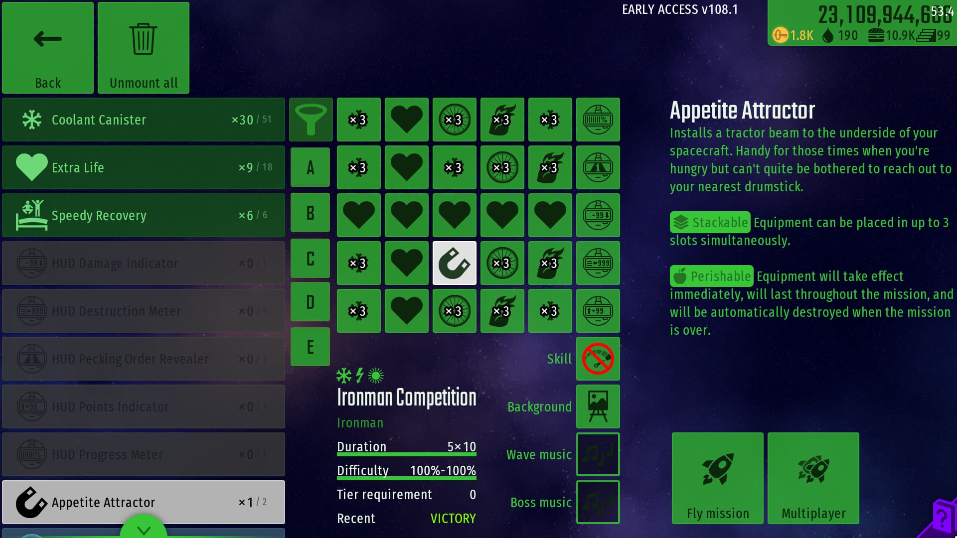
To start, we will introduce two new buttons on the menu: one for saving and one for loading presets:

1. Saving presets
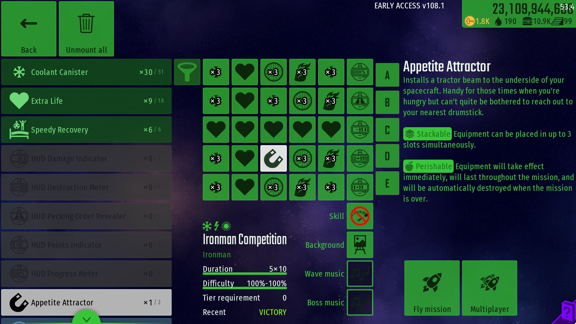
You can create a new preset by filling it out like you normally do. Once you’re finished, click on the “Save config” button (I forgot to highlight it in the image above) and this menu will appear:
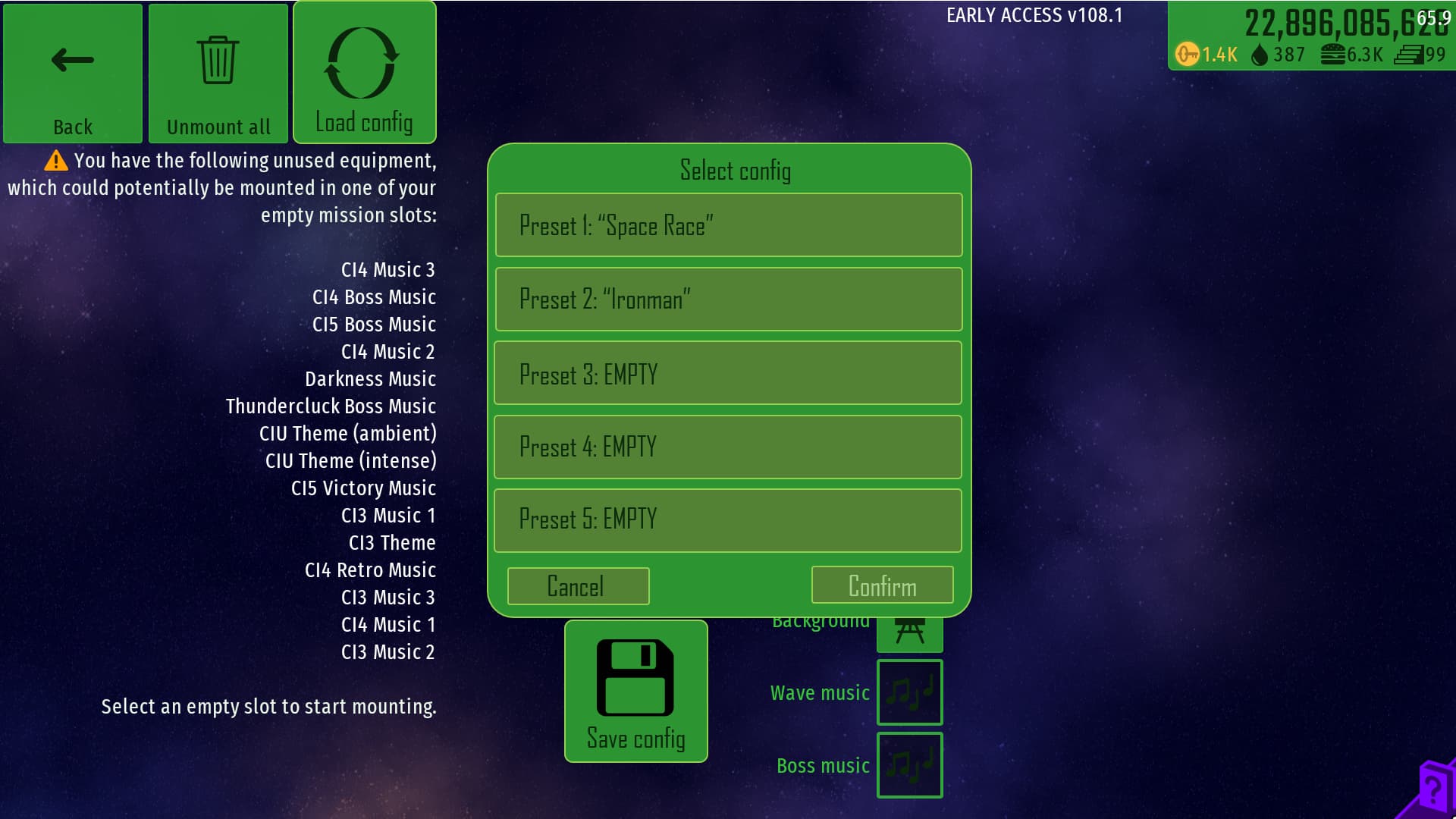
For the sake of demonstration, these two presets have been saved beforehand.
You can either select one of the empty presets, or select one of your currently saved presets to overwrite them. I’ve put five here but if anyone thinks it should be more or less, please say so. Click on one of them and it will ask you to name your preset. Let’s call this one “Normal Mission”:
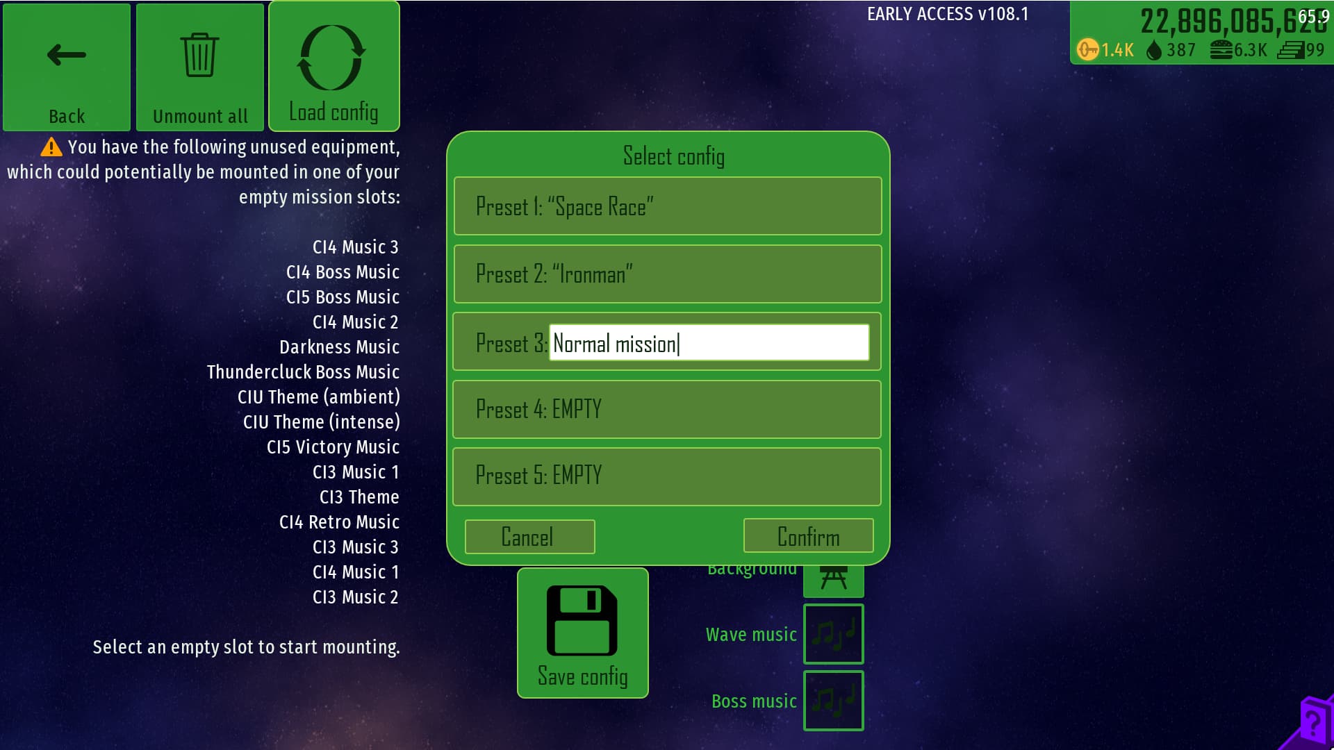
Then click the “Confirm” button to save it. It will of course ask for confirmation before saving.
2. Loading presets
To load an existing preset, click the “Load config” button
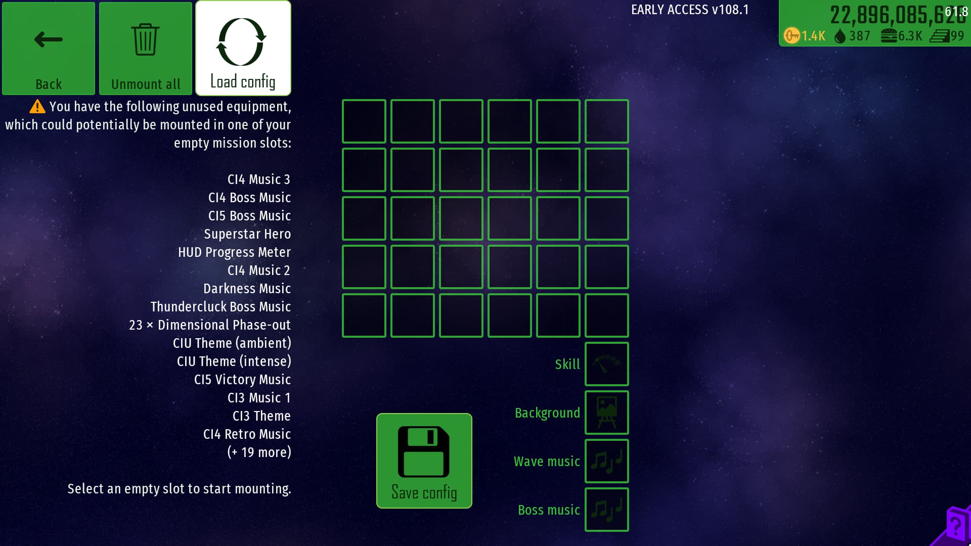
And this menu will appear:

You then double-click one of the presets to load it. Loading an empty preset will have the same effect as the existing “Unmount All” button: it will load up a blank config.
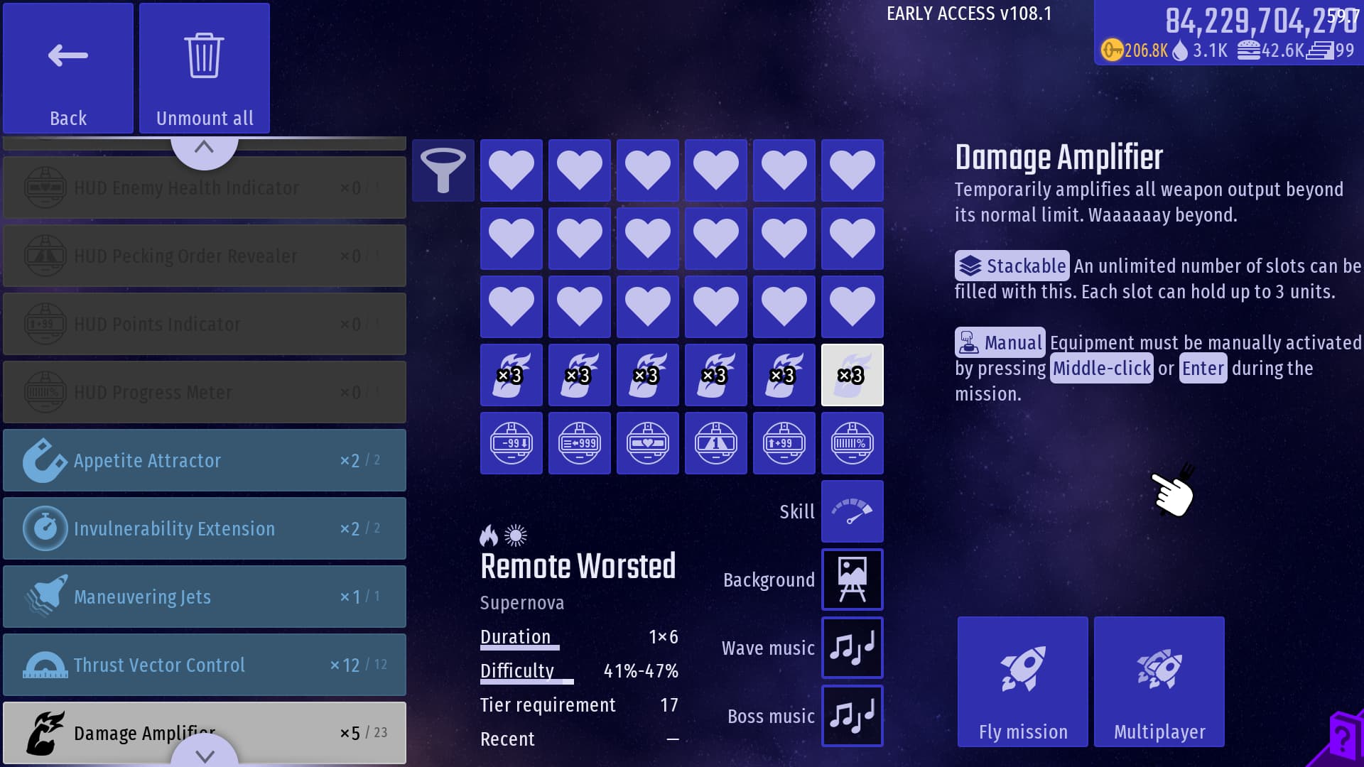
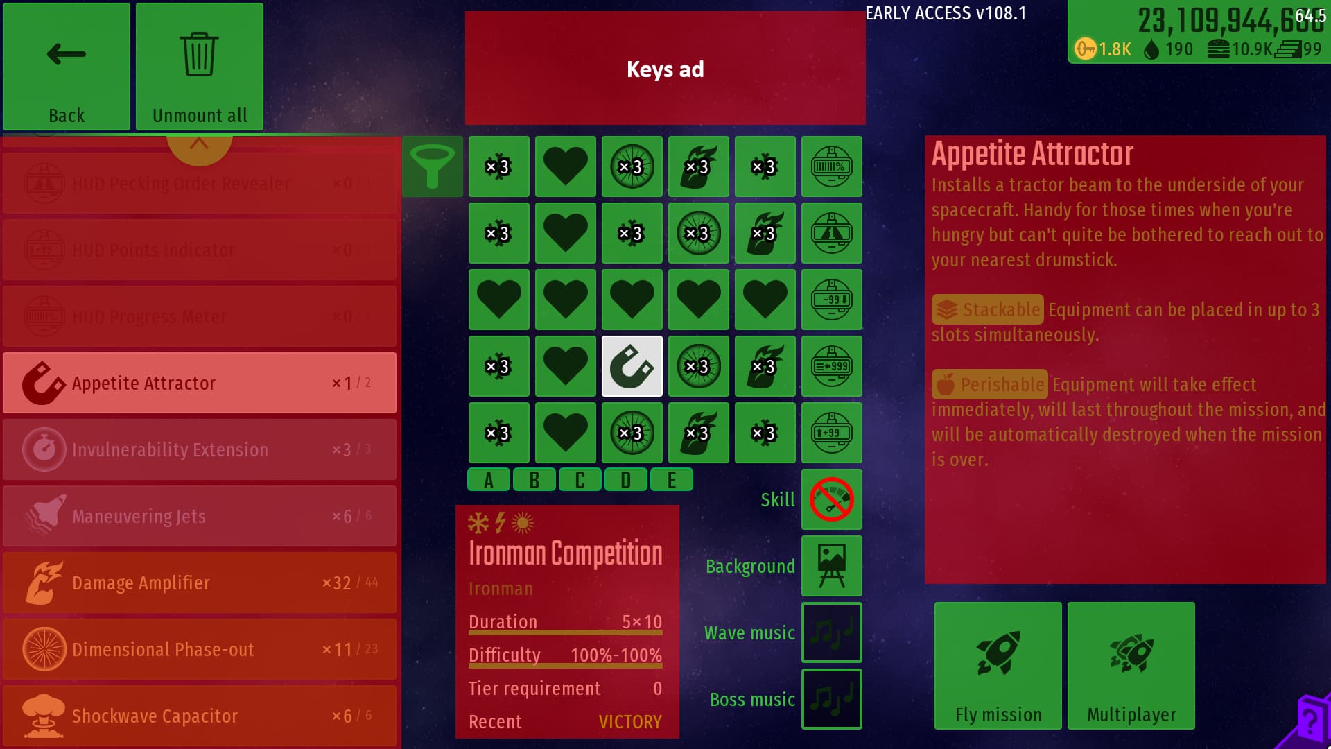
Here are screenshots of the respective presets:

Preset 1: “Space Race”
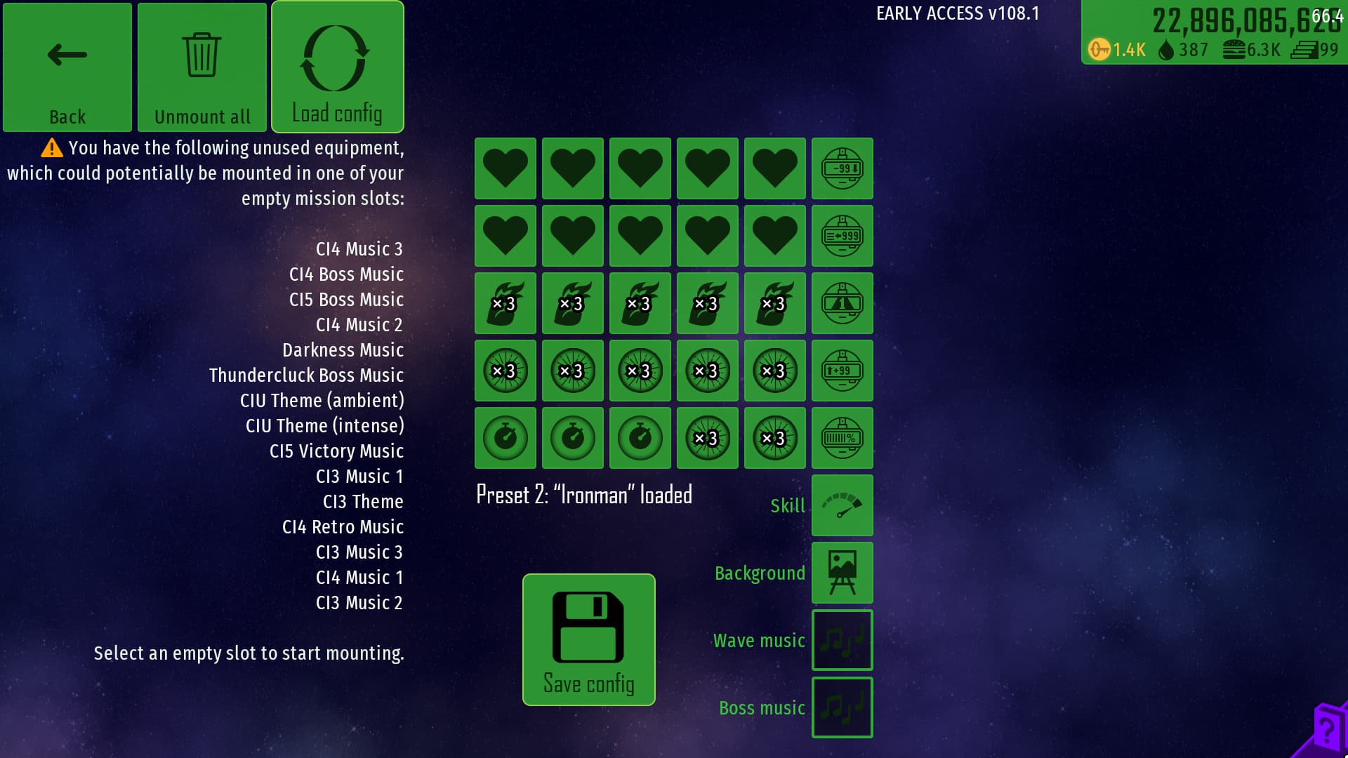
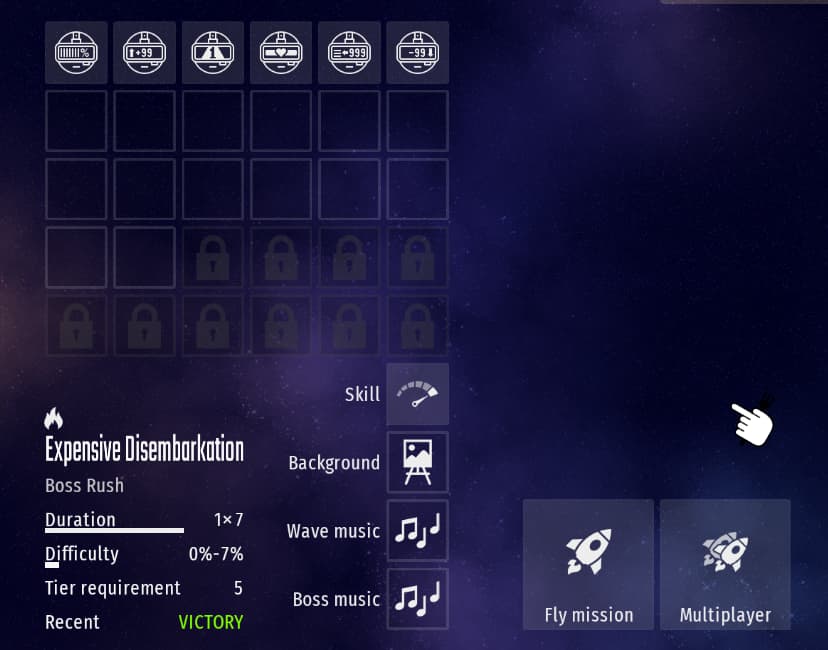
Preset 2: “Ironman (The SSH difficulty is added on anyway so don’t worry about it being mounted)”

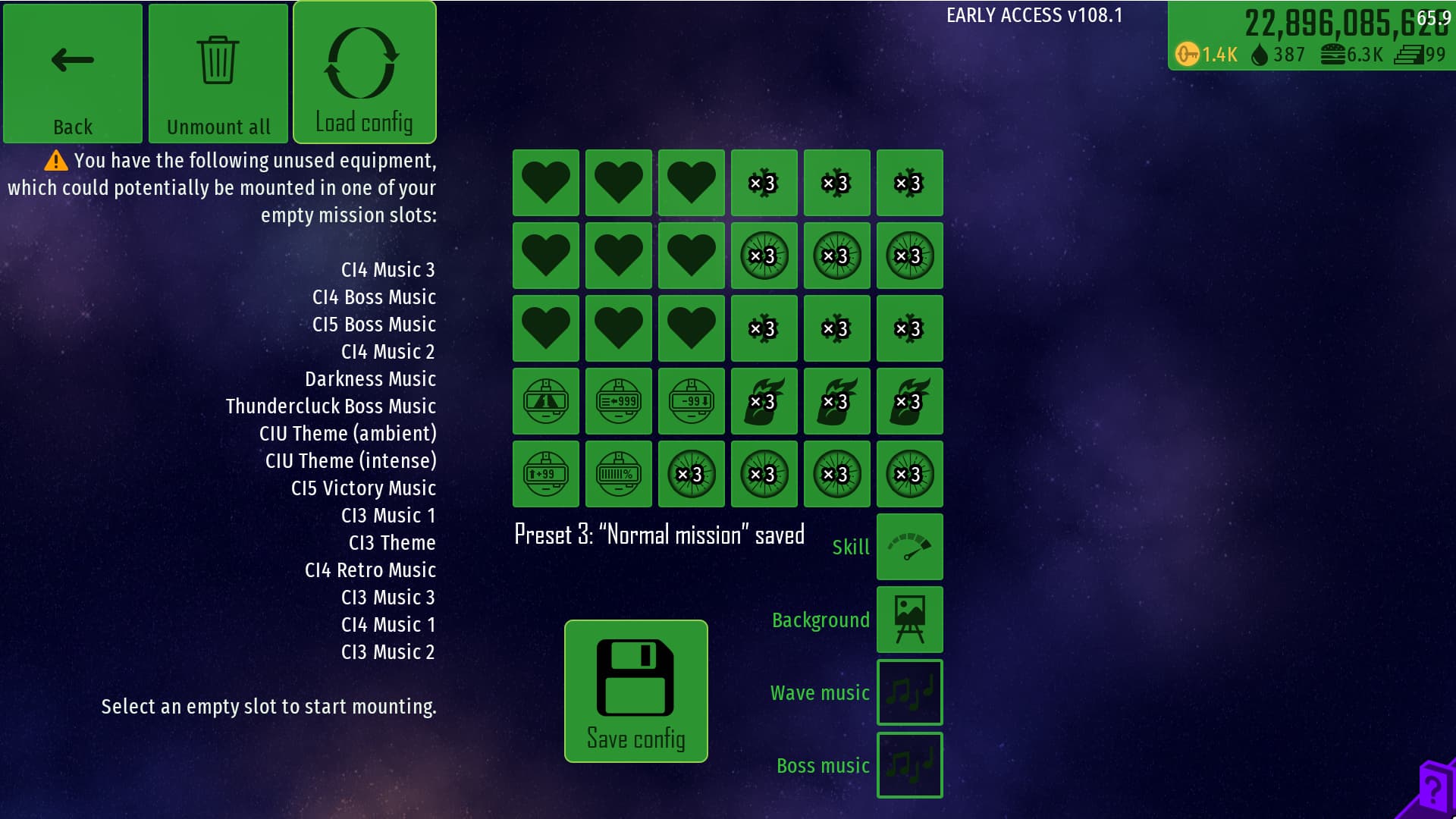
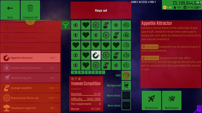
Preset 3: “Normal Mission”
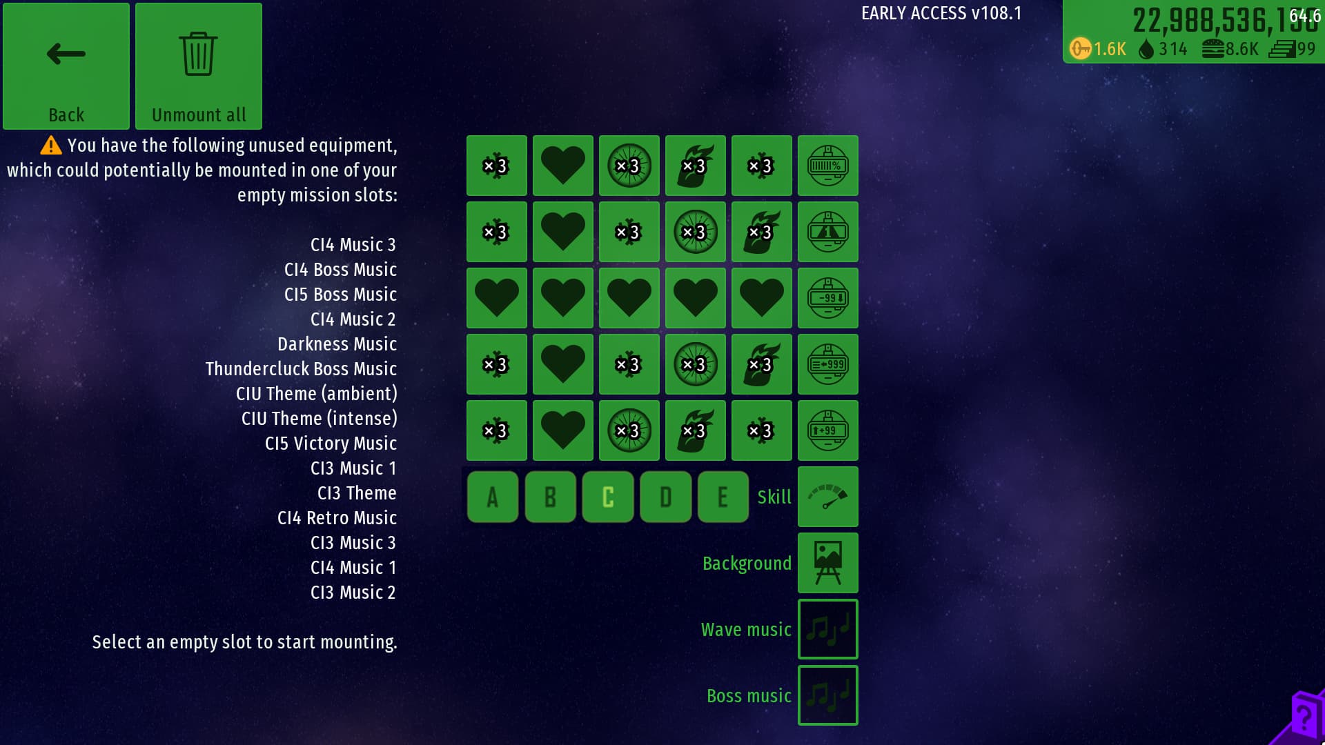
The way the presets will be filled is from left to right from top row to bottom row. So if for instance, I wanted to load Preset 2 but I only had 8 Extra Lives, 12 Damage Amplifiers, 18 Dimensional Phase-outs and 1 Invulnerability Extender in my inventory, it will look like this:

I blanked out that I had 5 Phase-outs left
EDIT: Alternative suggestion**
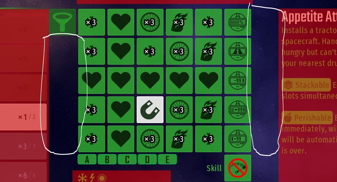
@trueuser, @RainbowBoyVN and @Starbrockle (thanks for pointing out the flaws you guys, you’re a big help!) brought up good points where there isn’t a good amount of space to implement the buttons, especially when factoring in space taken up by mission info and equipment descriptions. So alternatively, I came up with this idea instead:
This version is much more compact and less complex. Rather than having to manually save each different config, each config will have a dedicated button (A to E, shown underneath the config). Even though I’m concerned that this might be more vague and confusing for other players (plus I think my original concept looked cooler, gotta have some pride in your ideas), I think this would be a much more optimal choice while not sacrificing too much elegance. And I might not know much about programming, but I’m sure this would be easier to implement if iA were to add it.
But I don’t want to know what I prefer. I want to know what you guys prefer:
- Original
- Alternative
- Neither, I have another idea (please show me in the comments)
- I don’t want this added
0 voters
Whew! That was a long one. Anyone who managed to make it down here, thanks for taking the time to check out my proposal and I hope you will consider agreeing. If anyone has any other suggestions that can improve on this concept, please don’t hesitate to say so. Anyways, thanks for your time and peace!