Previous Main Screen Design and Current Main Screen Design
So, you all remember how the main screen was before the v145 update, right? It looked like this:

(I couldn’t for the life of me find a better screenshot).
So as you can see it’s pretty alright. You got a lot of options at the center and the info about the legal stuff + the credits and the version of the game, all in the top left corner (there should also be an X button in the top right corner to exit the game, but it doesn’t show on the mobile version). Again, pretty alright.
And here is how it looks in the v145 update:

Suddenly the main screen is not alright anymore, and it’s actually pretty messed up.
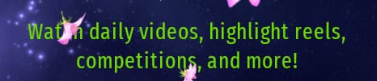
Top left and right corner are unchanged but the center now has only two options, which is either Play or Options. Now, Account and Langauge have been moved into the Options tab, which is good because they are indeed options, however the two remaining buttons look too lonely without other options on the sides. The Forum button has been moved to the bottom left corner, for some reasons, and it’s size it’s similar to the X button, except that it’s longer because it has text on the right side of the icon, which the X button doesn’t have, so this already makes a consistency problem. But I can’t go on without talking about the elephant in the room, and of course I’m talking about the bottom right corner, which not only has too many colorful icons, but it also has a lot of text on top of it. Now, I understeand IA wanted to promote this new GEN thing and grow the popolarity of the game by including direct access to all the CIU social pages, and I have nothing against it, but the way it’s presented it’s really too much “in your face”, and I think you get what I mean. This in conjunction with the placement of all the other buttons that are all over the place creates a total disorder in the main screen, and the seasonal content makes things even worse.
My Main Screen Redesign
Many have said that you just have to get used to it, but I’d say “not in this case”, since the feedback from the players is important in a game directed and managed by just one person. So that’s why I made a mockup to illustrate how the main screen should look like, eliminating the bloatwere and making things more clear, at the cost of a few extra clicks. But enough talk; here is my proof of concept:

As you see it’s simple, clean and familiar. It looks similar to what it was before the v145 update and actually improves upon it.
So let’s start with a general look: no buttons all over the screen and on the corners, with the exception of one, which I’ll come back to in a moment. No text and colorful icons to distract the eye; everything is at the center and it’s perfectly organaized in the sub screens of each one. So now there are more buttons at the center so that that part of the screen doesn’t feel kind empty but it’s still kept simple to not overbloat the screen, and there is even one less compared to the previous version, so they now fit under the Universe text, which helps make them appear even more clear and absolutely not out of place.
The only exception is the X button, but now that button has been fixed completely.
To start, it no longer shows just an X but it also says Quit, so you know for sure what it does. Maybe you think it’s just a minor deteil and it was perfectly understendable without it, and that might be true but in this case, where all the other buttons have an icon and the text for what they’re about, it’s logical for the Quit button to do the same, so that it doesn’t look out of place. The Quit button is placed in the same exact postion of the Forum button in the current version, but the position of the button and the addition of the text on the right side is not done randomly, in fact this is a direct reference to the episodes’ Quit button, which were all exactly like that: a wide button in the bottom left corner with an X and the Quit text on the right side, so this makes it much more in line with the episodes’ Quit button.
You might also have noticed that there are four main buttons under the title, again, exactly like the episodes’ main screen. My initial thought was in fact to make the main screen identical to the episodes’ one, but CIU is a little bit different from the episodes, not only for the game as a whole but for the style of the buttons and icons too, which is flat here, but in the end I still managed to find the perfect mix between the episodes’ main screen and the CIU main screen, so at this point I really don’t know what could be even more perfect than this.
My Tabs Redesings
So that was a general look, but you’d noticed that there are two new buttons near Play and Options, which are Socials and Info. Let’s examinate them one at a time.
First I’ll talk about the Social tab. It’s pretty straight forword; this is where all the links for all the official social pages for CIU will go, but in a well organized and fitting way. Here’s how it would look like:

As you can see it’s in the same style as the Option and Language tabs, and the icons are flat so they fit with the rest. There are the already existing icons from the current version in the same order, just from top to bottom instead of from left to right, plus two more. The first extra one is for the CIU Discord server, which yes, I know it’s technically “not official”, meaning that it wasn’t made by IA but rather from the community, but IA is in there and it’s still the only CIU Discord server, so if he want to get full circle he may as well add that too among the other CIU social pages links. The other one is for the CIU forum, which maybe it’s not technically a social, but… it still is, just not quite like the other ones, so I think it’s better off just put the Forum button there among the other CIU social pages links.
Then we have the Info tab, and this is a bit more interesting, so let’s take a look at it first:
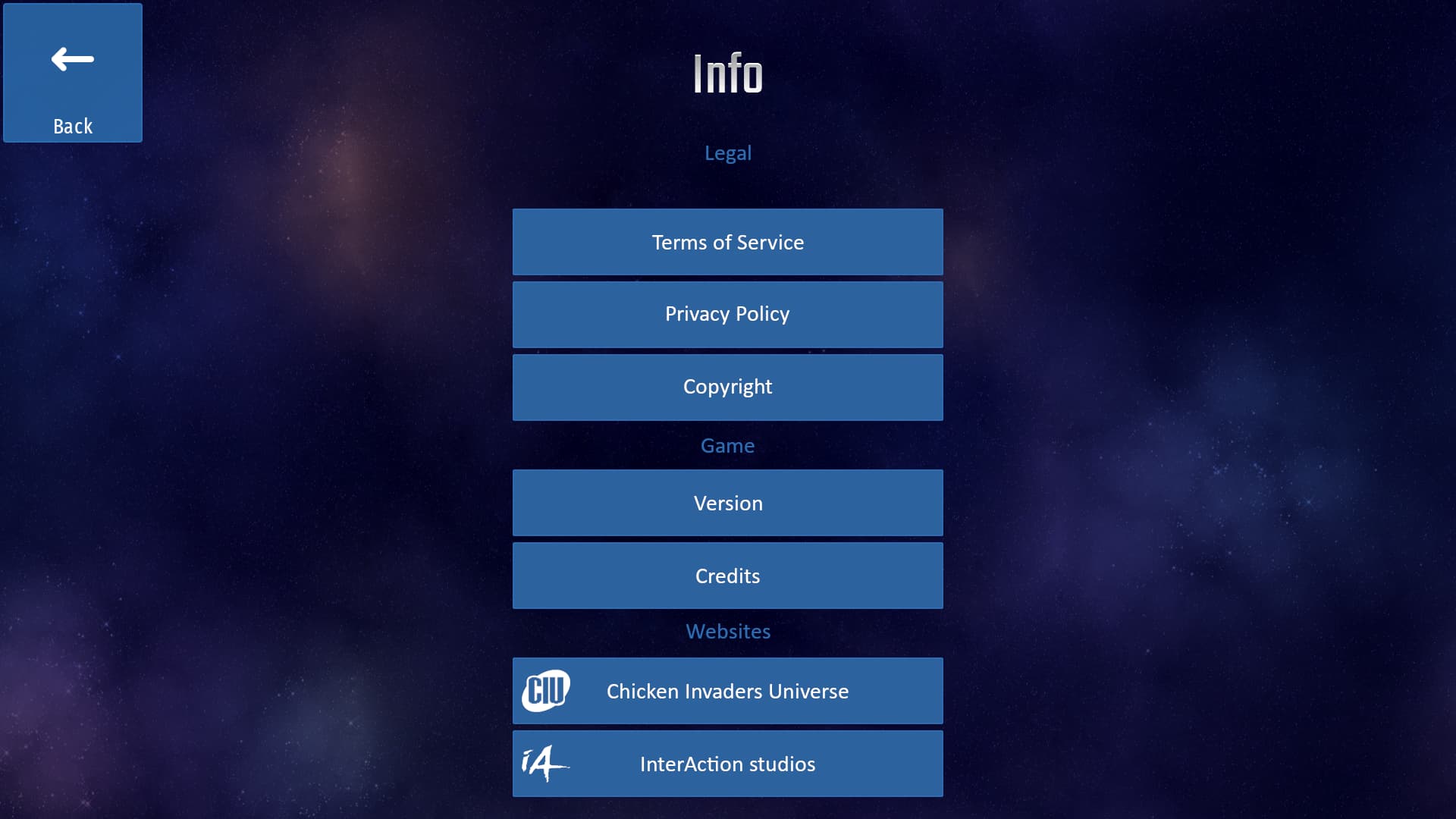
Almost the same style as the Socials tab, but this is divided into three categories: Legal, Games and Websites.
The Legal section has all the legal stuff buttons that is currently on the top left corner of the main screen. So there is Terms of Service, Privacy Policy and Copyright. Copyright shows indeed the copyright, that is currently shown in the Legal button in the same place of the other legal stuff buttons. Here the button is renamed to Copyright to actually show what is supposed to show, and Legal becomes the name of the section in the Info tab, to make everything clear and avoid confusion.
At the Game section we have two options: Version and Credits. The Version button shows the version of the game you’re currently playing, so the text line that is currently in the top left corner of the main screen gets shown there. Same goes with the Credits button, which… it’s just the Credits button from the main screen. So for the Game section you can see what version of the game you’re currently playing, the seasonal content, the platform, the architecture and everything that gets shown into that text line in the main screen, and Credits because… well, you get to know who made the game and who contributed to it.
Lastly we have the Websites section, which are just direct links for the CIU website and IA’s website. You may be wondering why these two buttons are not in the Social tabs, among the other CIU social pages, and the answear is pretty obvious: even though they’re web pages about CIU they’re not social pages for CIU, here’s the difference; in a social page you can chat, leave comments and stuff like that, but in those two web pages you can’t do that and must be taken for what they’re. That’s why it’s better to have them on a separate section in the Info tab. I think it’s good to have all the links for all the web and social pages of the game all at the press of two clicks, but at the same time it’s important to have them well organized with a criteria; it will not fit well to have the web pages among the social pages, since they’re not actually the same, and having a tab called “Socials and Wbsites” will seems too long and not very fitting. I thought at first to make another button near the Social tab just for the web pages, but if they’re only those two it’s not even worth it, so I think they fit well as separate section in the Info tab, cause that’s more liekely what they’re; they’re there to have information about the game itself as a whole, or you can go even faurther and explore all IA’s catalouge of games, including CIU, so I think they could fit really well as I designed them here.
One last note about this tab is that it may be better to have the various sections with more distance from each others, so maybe it would be necessary to scroll down for the Websites section while trying not to hide them (I wanted to show the tab in that way but I got lazy and fitted everything in the same screen, that’s why I had to specify that).
Conclusion
That’s pretty much all I had to suggest about this. I think you can’t make an even cleaner and more organized menu than these, but maybe I’m wrong. After all I can already imagine people disliking this design because it will take them a few more clicks to get the option that they want, where as with the current design more stuff it’s just right in front of you, but I personally view this more as a problem than a convenience, because there is too much stuff on screen, even badly placed and without a proper order, while this is well organized and clean. If people say that you just gotta get used to it then I think this would be the perfect menu design to do so, because it’s all organized in a logical way, so after a while it becomes second nature to click on the option that you want in the proper tab instead of having some of them in one convoluted screen, but again that’s just my opinion.
Again, I understeand IA wanted to push this new GEN thing as much as possible to advertise the game even more, so he putted all the focus on the social icons right at the main screen so that everyone would see them, and it seems to have been working pretty well, since they catch a bit too much attention, but again, I’m not against this idea, even though I’m not a social guy and I only use YouTube, Discord and the forum, but that’s the point; not everyone is interested in this, so don’t make it appeal so much. If people are into socials then they will certainly click on the Socials tab and from there they will do the rest, without the need of colorful icons and fancy (unnecessary) descriptions.
So yeah, that’s pretty much it. Feel free to leave your opinions, critics and whatnot, even if you don’t like my menu redesign in whatever way, tell me without problems. Actually, if you have some redesign idea for it then leave them here and we could discuss it. I’m sure we could arrive at a compromise and improve the layout and organition of the tabs, screens and buttons, because as I said before, there is no reason to just live with something you don’t like if you can give feedback to the developer and have a chance to make it change for the better. This is one of the good aspects of CIU so may as well at least try, like I did.