Heh the never overheating never happened to me LOL
I think i know you medo 2
Again, it’s a ſtyliſtic thing.
In your ſtyle guide, you’ll find that it’s wrong, but it is ſtill ſaid, eſpecially in informal ſpeaking.
HAHAHAHAHAHA its so funny it even happened to me
I can recognize only Vulcan, i think Vulcan should be came back old color, and Absolver should be changed to pink+orange or pink+violet instead of violet+orange, my opinion…
The proposed colors were different. Not sure why IA went with pure red and blue, considering the fact they’re the “big no-no” color combination in art.
Red and blue are both extremely strong colors, so they “compete with each other” when combined. And it often ends up looking eye-hurting.
Here’s an example:
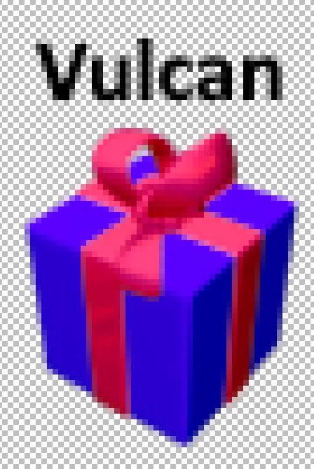
I’d love to see Vulcan’s gift box get these colors instead:
A darker Electric Violet for the box (#5900FD hex code) and Wild Strawberry for the ribbon (#FF4482). It fits the color theme of the weapon very well and is easy on the eyes.
This was originally suggested by @GgWw1175, later mentioned again in my post about colorblindness.
This color combination would be far too extreme, just like pure red and pure blue. The current one (Web Orange + brighter Electric Violet) is a very good color combination.
Boss Rushes randomly spawn bosses so yeah, Bossa Nova is possible in frozen wastelands
The ribbon on Vulcan should be white imo, because the non-overheated version has white heads with dark blue streaks, and the gifts should reflect that.
The idea behind these color choices is that they reflect the weapon’s heat progression. And I chose these exact colors, along with the other gifts, because they would be easy to distinguish for colorblind people. And they also look better for people with normal color vision.
What font color are you referring to?
In my opinion, any shade of red on the Vulcan ribbon is going to look ghastly. Better to go with white as it’s already quite similar to Photon and Absolver.
Here’s a comparison between these gifts:
New gift (b: 0000FF / r: FF0000): 
Yeah, those colors clash hard. Nothing more to say about it.
My proposed gift (b: 4600FF / r: F00046): 
The box color was sampled from Vulcan’s sprite. This is probably the most accurate one in relation to the weapon’s color scheme. I haven’t seen anyone say that it looks bad, so I assume the colors fit well enough.
Sufi’s proposed gift: (b: 5900FD / r: FF4482): 
This would also work, but I feel like the box is too purple and the ribbon is too desaturated
That’s what I did originally, but a lot of people said that the ribbon should be red, so I changed it.
Known:
You’ve already got your medal in v.48
I don’t never use double negatives.
Because color clash is irrelevant for gifts – the only criterion is that they’re readable (admittedly, apparently this isn’t the case here Early Access version 48 - #82 by Kylo-Hen)
I don’t want to shift towards violet, it’s already cramped there by other gifts.
Pure blue is relatively ‘spacious’, so that’s what it’s going to be. I’ll just make the bow a lighter shade of blue (almost white). Doesn’t quite fit with the projectile, but it’s a secondary concern.

Well, this one is about a In-Game Tip:
Tip: Generally, stay at the bottom of the screen, only moving up when absolutely necessary.
Can it be changed to:
Tip: In general, try to stay at the bottom of the screen. Only move up when absolutely necessary.
No need for a medal.
Why?
I just feel like it sounds a little odd right now is all. It’s pretty much copy-pasted from the Chicken Invaders Readmes, and because of that, the grammar just sounds slightly off to me.
We’ll just see if iA will make that change. It can’t be too difficult to make.


