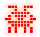
why you kept the glowing green? I mean, it would have been more interesting if it was red
2 Likes
It’s still a good color balancing art though, i’m not saying it’s bad, but it’s rather a improvement for it
1 Like
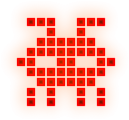
there you go took me 2 seconds
7 Likes
Yeah, something like this, good attempt
1 Like
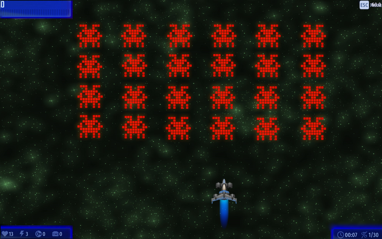
Rather EVIL Retro Invaders
1 Like
Putting an adjective in front of something doesn’t make it realize its meaning.
1 Like


Sign why we can chose multiple options? Disable it, please.
1 Like
People just can like more than one of the desings, you should have in count that
1 Like
He said:
Read carefully next time.
1 Like
Yeah, i am allowed to tick multiple choices, i should only select one
2 Likes

The Space Demon
2 Likes
Hello ppl, here is a Yolk Star that I did a few hours ago, and tbh, i expected something better than this, i mean, i draw almost every days but I wanted to do something different, so this released, im not used to do ci draws, so im very dissapointed of this.
(Apart from that I forced the compass to make the circular side where the satellites are located)

10 Likes
Looks kinda cool to me
1 Like
Zombie chicken V 2.0
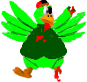
And V 1.0
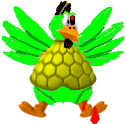
6 Likes
but those belong to the halloween
why you kept making them?
For a zombie it should be Halloween night?
Now What you want?
Zombie is from the halloween monsters
i am just asking