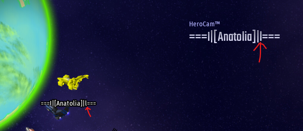
Here, you can see that due to the font, its quite different from the above, menu text.
Which can cause issues like i wasted my keys on a fancy callsign but its not what i expected it to be.
Please change this.
Please change this.
i’m pretty sure you can just replace that with a capital I
I found the solution to your problem, deactivate the display of player names, so it saves you with small bad writings until it is corrected :v
I did, but you still have to pay keys to see if your typing is correct.
I don’t see the reasoning behind using the capital i at the left part but using a small L on the right part. Moreover, if the small L is “corrected”, then we hit the biggest flaw of any Latin font: l and I being indistinguishable, which is far worse. Therefore, the only thing to blame here is your own attention to the letters you type (“CIU forum users can’t read” hits harder and harder the more time passes, huh).
it was a mistake, thats the reason. But you’re also right that its the flaw in the font. But there should also be a preview button or something.
why do you need a button for previewing something you can already see
Different fonts have different glyphs. That’s their whole point. ![]()
This topic was automatically closed 14 days after the last reply. New replies are no longer allowed.