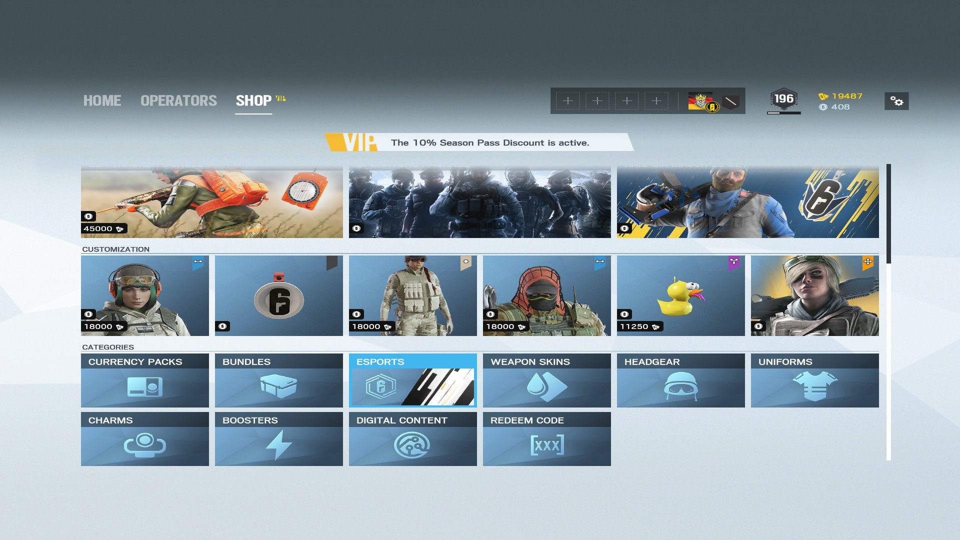
Current User Interface of the shop is complicated. As a new player, its hard to find anything on market. I recommend to update the shop more New User Friendly.
On the image, its a shop interface from random game.
Note: Do not forget this is just an idea, please be kind.
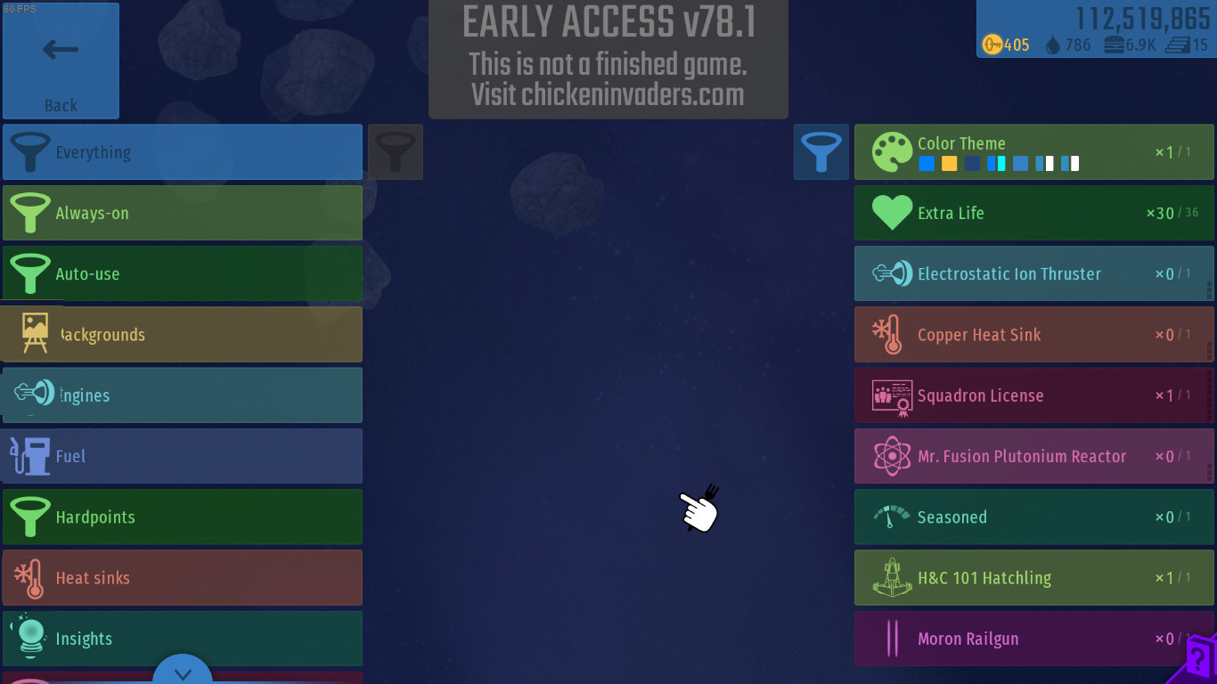
However, I currently don’t have a better design in mind. Note that you can use the “filter” buttons – they work much in the same way as “categories” in your screenshot.
What of a grid to sort by item type, and items being displayed in lists. With a grid one can place logos on it to show what kind of equipment is present in the category.
Maybe the icons on the left can be updated?
(like backgrounds filter image as this )
Engines filter image like this:
edit: Like this (sorry, i am bad at photoshop :p)
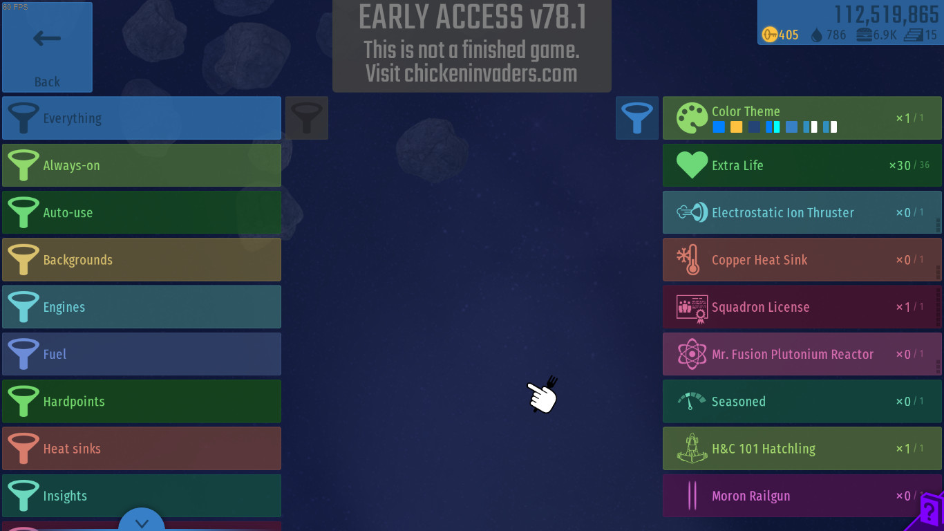
 )
)